THE SWEETNESS BAKESHOP
Visual Identity Design
The Sweetness Bakeshop is known for its elegant, custom cakes, pastries, and packaged goods. High-quality baking is one part history, one part science, and one part art. So much dedication and craftsmanship can go into the little treats that we can easily absentmindedly devour. We wanted to create a visual identity that reminds the audience to slow down and think of all the experience and skill that goes into those delicious bites of sweetness.
In October 2018, The Sweetness Bakeshop (formerly Bakeology) was rebooting in a new city. The goal for The Sweetness Bakeshop's visual identity was to reach a new audience; representing the experience that Sara (owner of The Sweetness) had spent years building, iced with a layer of joy, and sprinkled with a little bit of magic.
Client | The Sweetness Bakeshop |
Date | October 2018 - Present |
Scope | Logo |
| Visual Identity | |
| Packaging | |
| Website |
Project Goal
Create a visual identity that:
- References the history and depth of technique in elegant baking.
- Asks the audience to slow down and appreciate the detail that goes into handmade baking.
- Represents the joy of eating.
Target Audience
The Sweetness Bakeshop brand needs to target an audience that sees eating and sharing baked goods as a way to enhance and create a moment worth remembering.
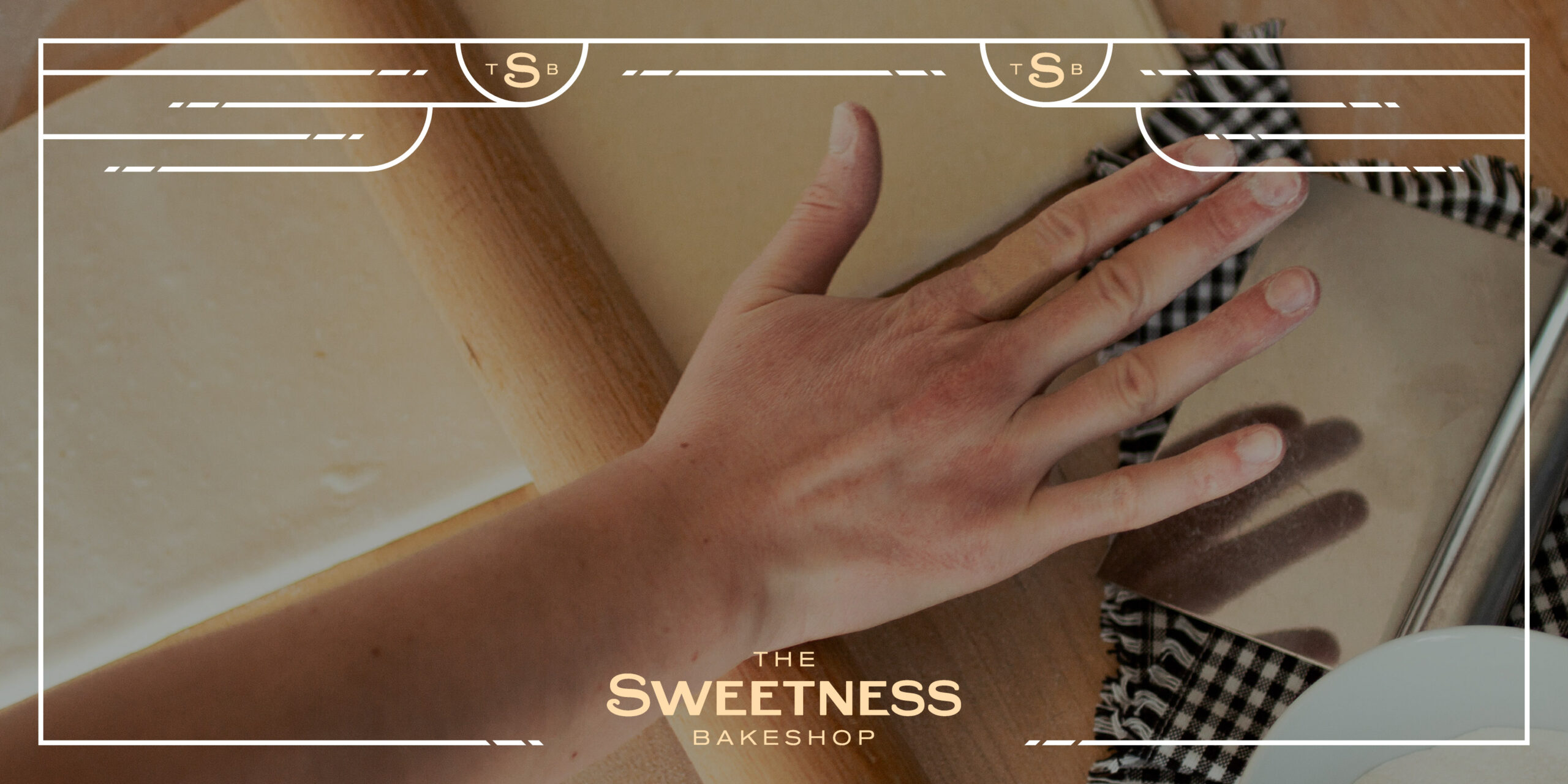
The Logo
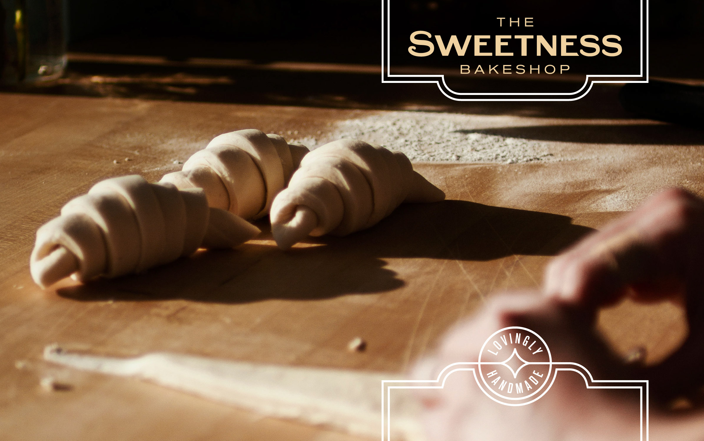
The history of baking and the city of Paris are inseparable. For The Sweetness Bakeshop's logo, we wanted to reference that history by creating a custom wordmark inspired by the Art Nouveau posters and ads of the 1890s.
After building the wordmark typography from scratch, we knew we also needed some kind of icon to represent the brand on social media platforms and websites. Our letter S, with its little curly-cue tail, had the right character to hold the visual identity all on its own when representing the brand at small sizes.

The Visual Identity
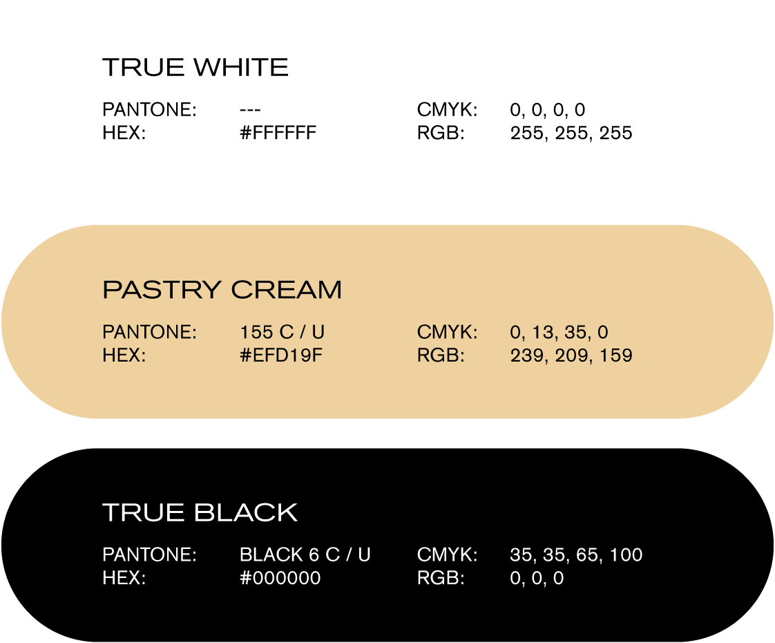
In chasing the character trait of elegance, and after creating a simple logotype and icon, we chose a very restrained colour palette: true white, true black, and cream.
For the rest of the typography, we needed a typeface that could pair well with the historical references of our custom logotype, but had a wide range of expression. Akzidenz-Grotesk, a typeface originally released by the Berthold Type Foundry in 1896, had the history and character we were looking for. Over the years, many weights and widths were added to the family, giving us the extended and condensed variations we functionally needed.
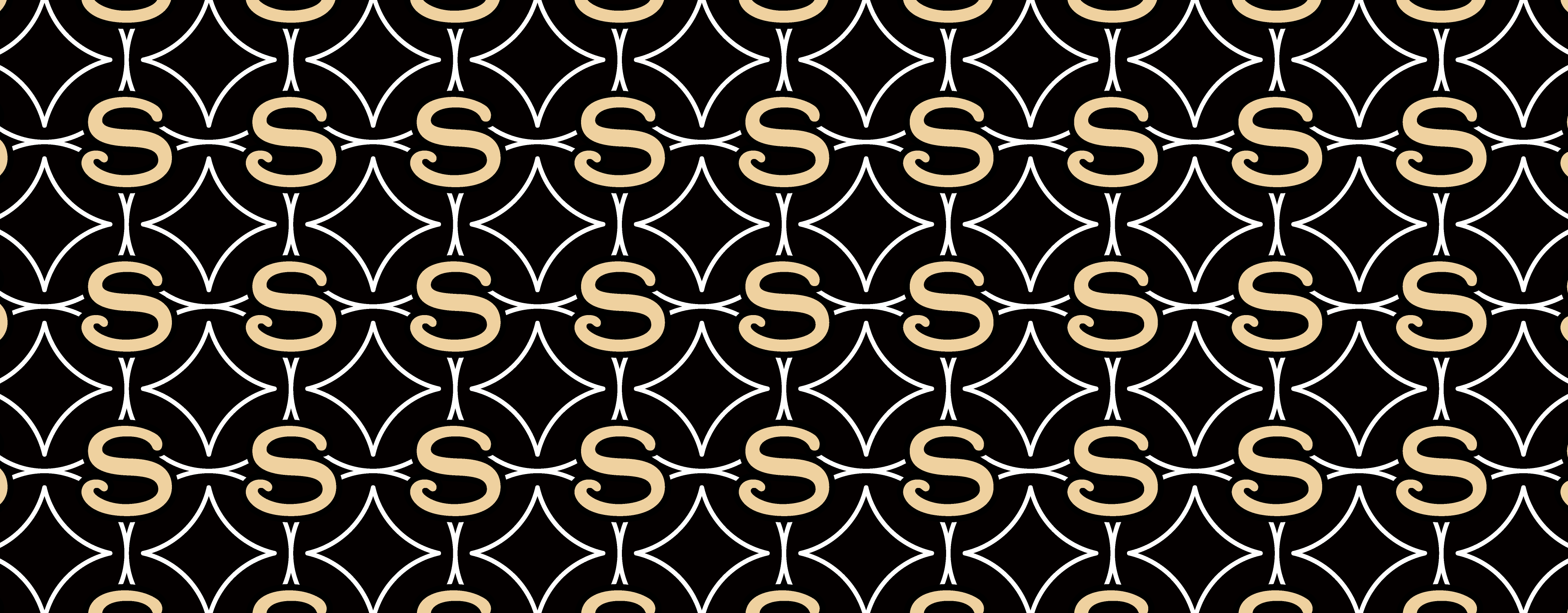
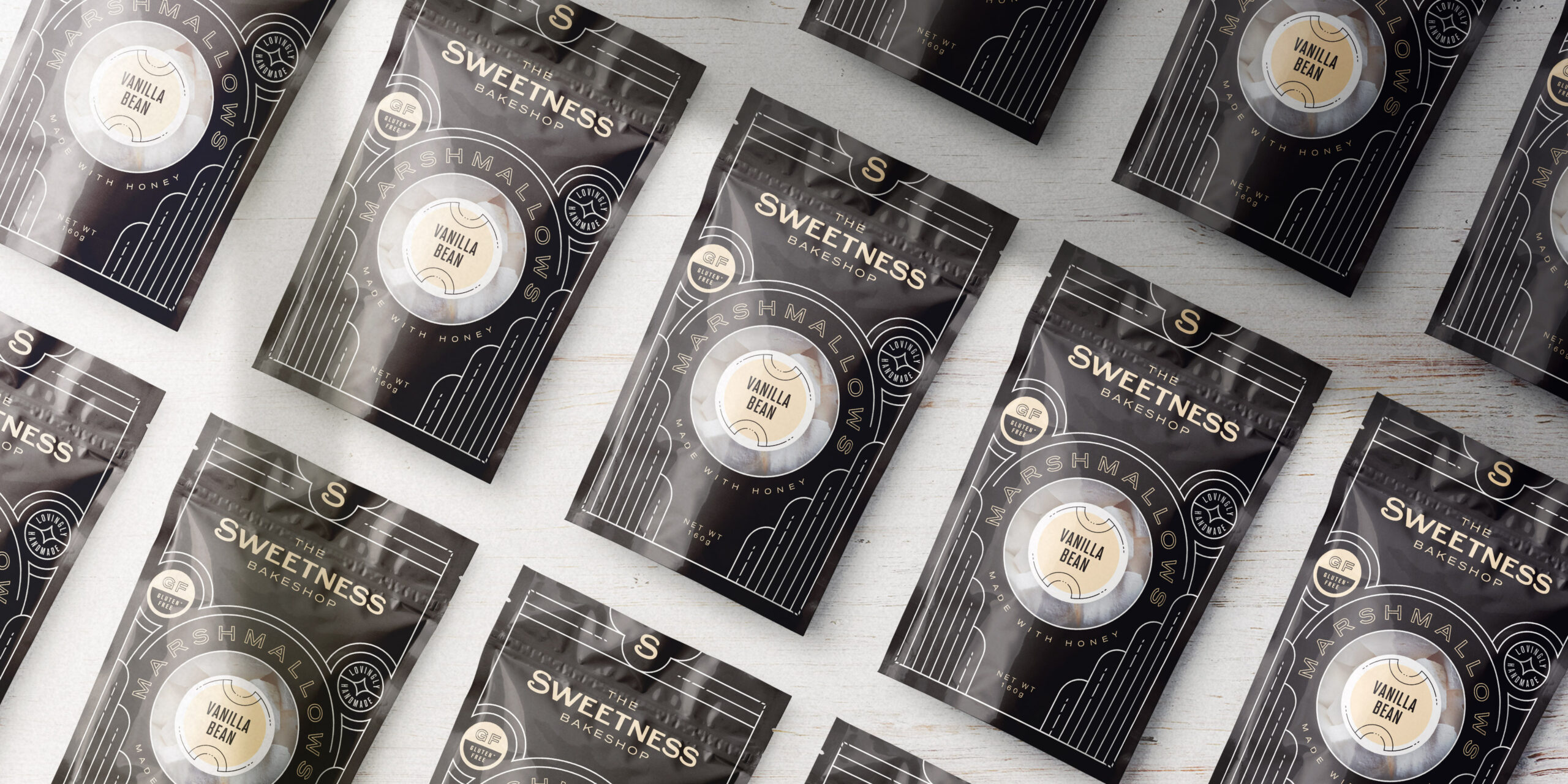
With so much restraint and simplicity in the visual identity so far, we created a decorative linework system that asks the audience to slow down and appreciate the details. For that, we referenced Art Deco linework to create frames and spaces that could also function as a brand asset in their own right.
Packaging and Website
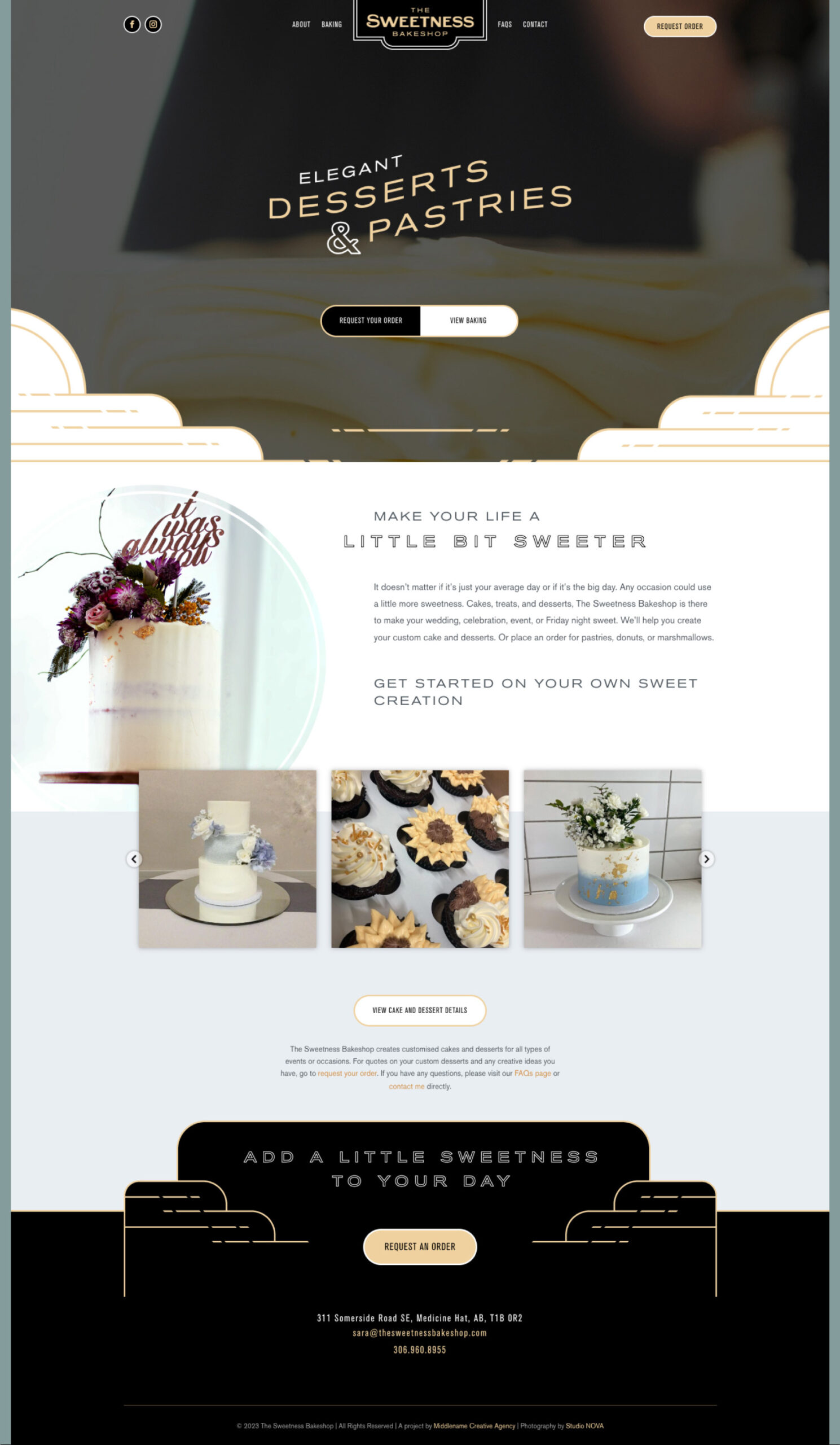
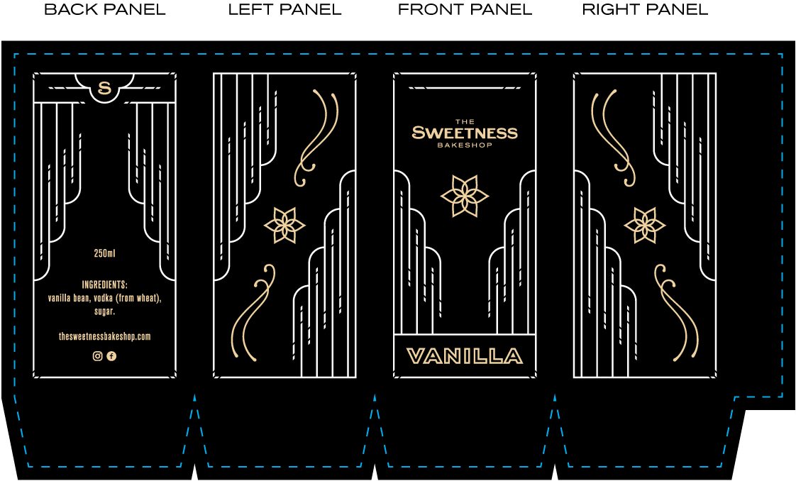
All of the brand assets in this visual identity act more as a kit of parts, rather than a prescription of how each product should be rigidly designed. From creating the labels to the website, the goal was to design something that would build strong brand reinforcement while being playful within the visual identity.
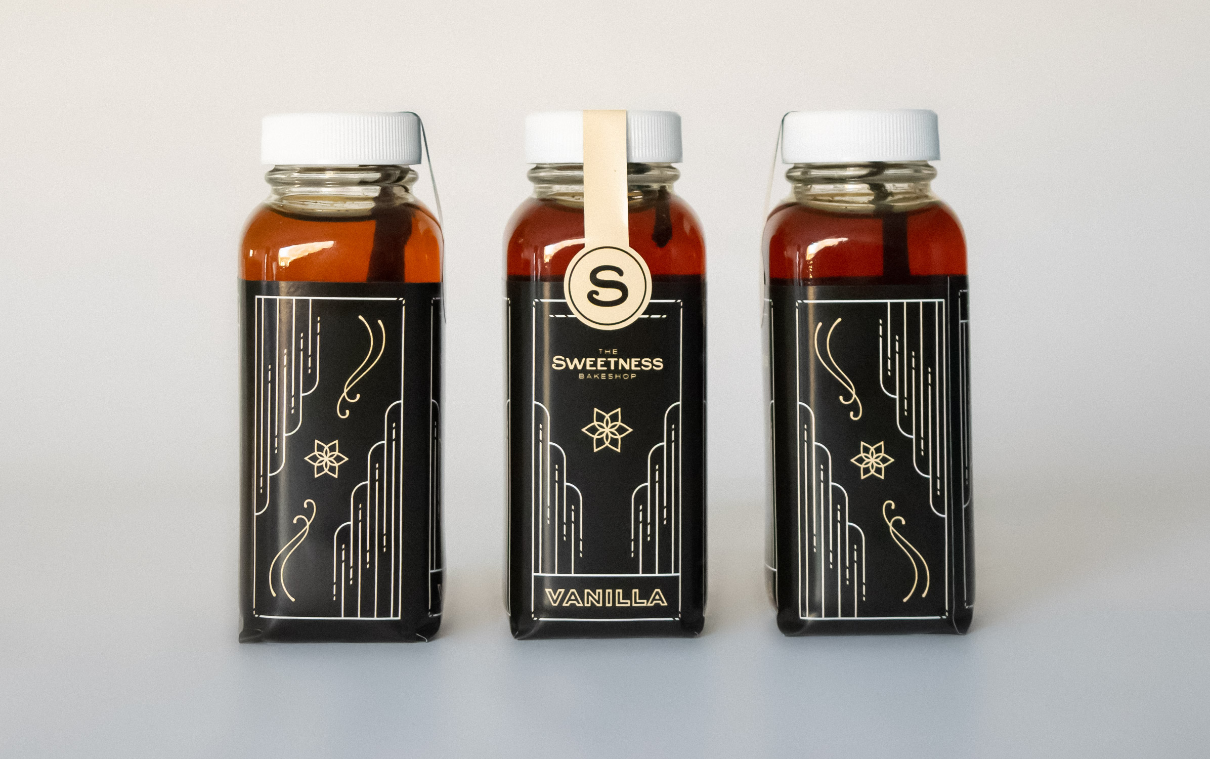
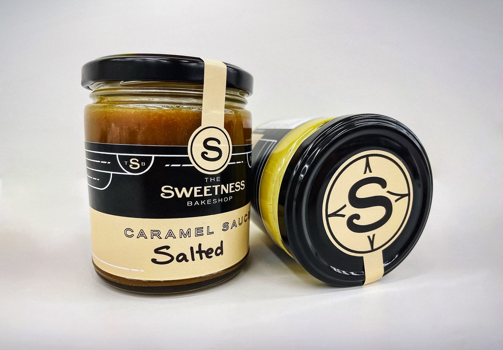
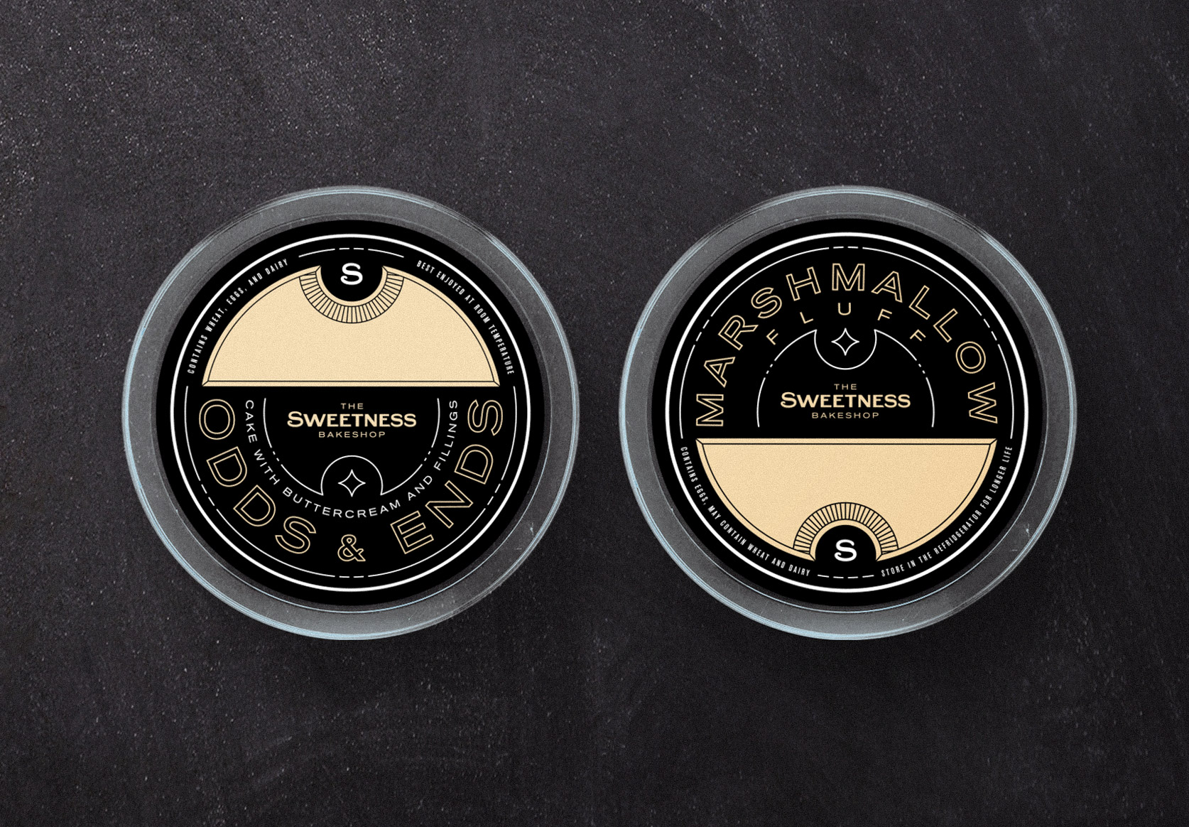
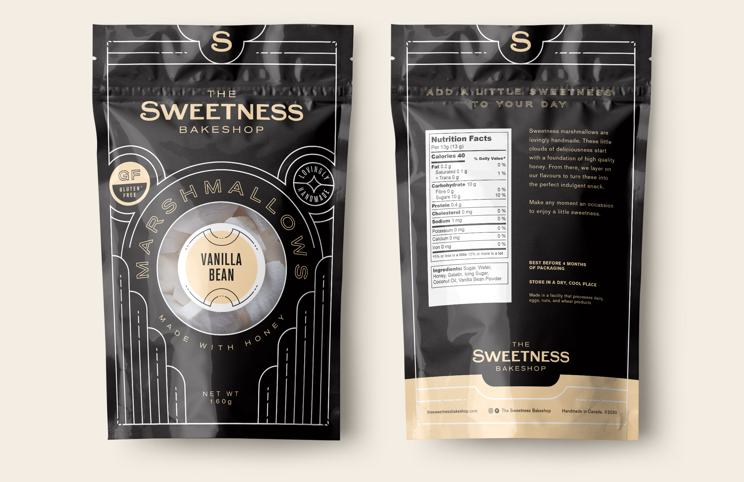
We designed packaging for vanilla, spreads and sauces, and marshmallows in a way that was easy and inexpensive to add new flavours. We also know that customers eat (and buy) with their eyes. So we designed the packaging in a way that lets the actual product be visible.

"I wasn't too sure of what I was after for my business's visual identity when I first sat down with Kyle. I wanted something elegant and different from similar businesses. Middlename nailed it. The whole process was so easy. Customers have told me they chose my business because of how professional and luxurious my website and packaging is. That's exactly the result I was hoping for."


