MEDICINE HAT BREWING COMPANY
Beer Label Design
One of the most competitive spaces is the liquor store beer fridge. Brewery upon brewery are screaming not just for attention, but for a customer to pick up a six-pack and buy it without necessarily knowing exactly what they're getting. If you're a brewer, once your beer is in the liquor store beer fridge, your packaging is your last chance to make the sale.
Client | Medicine Hat Brewing Company |
Date | 2023 - Present |
Scope | Packaging |
| Illustration |
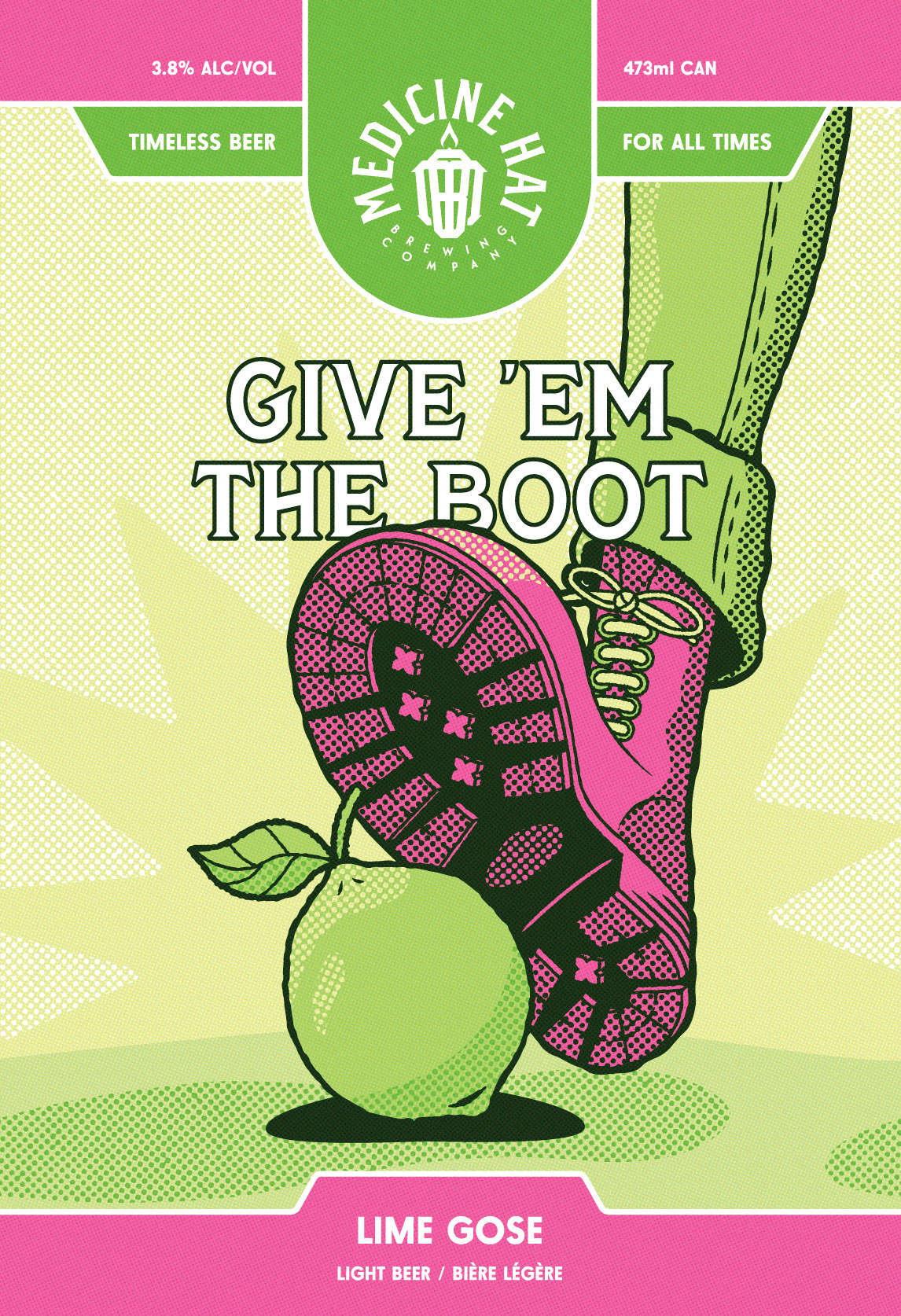
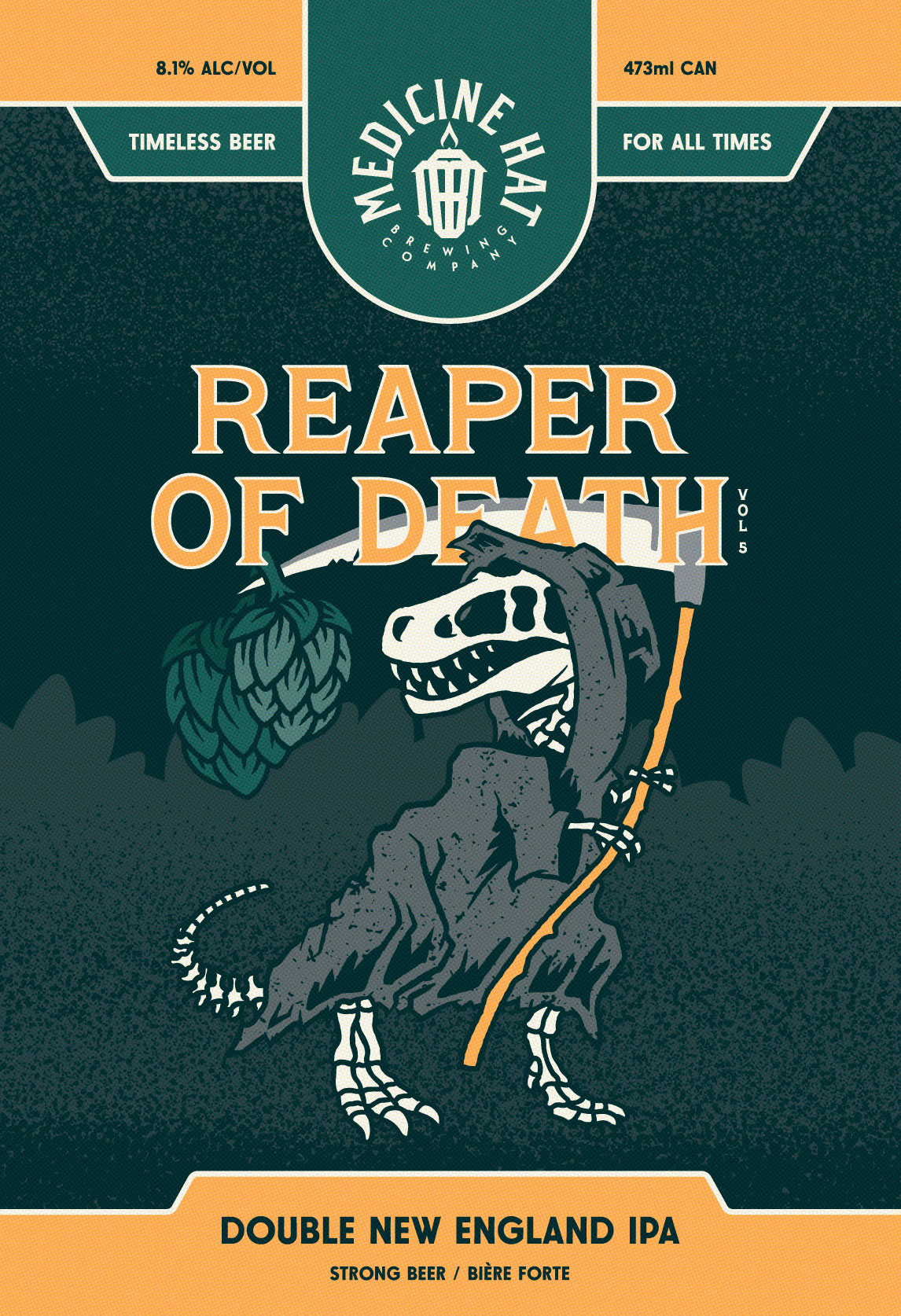
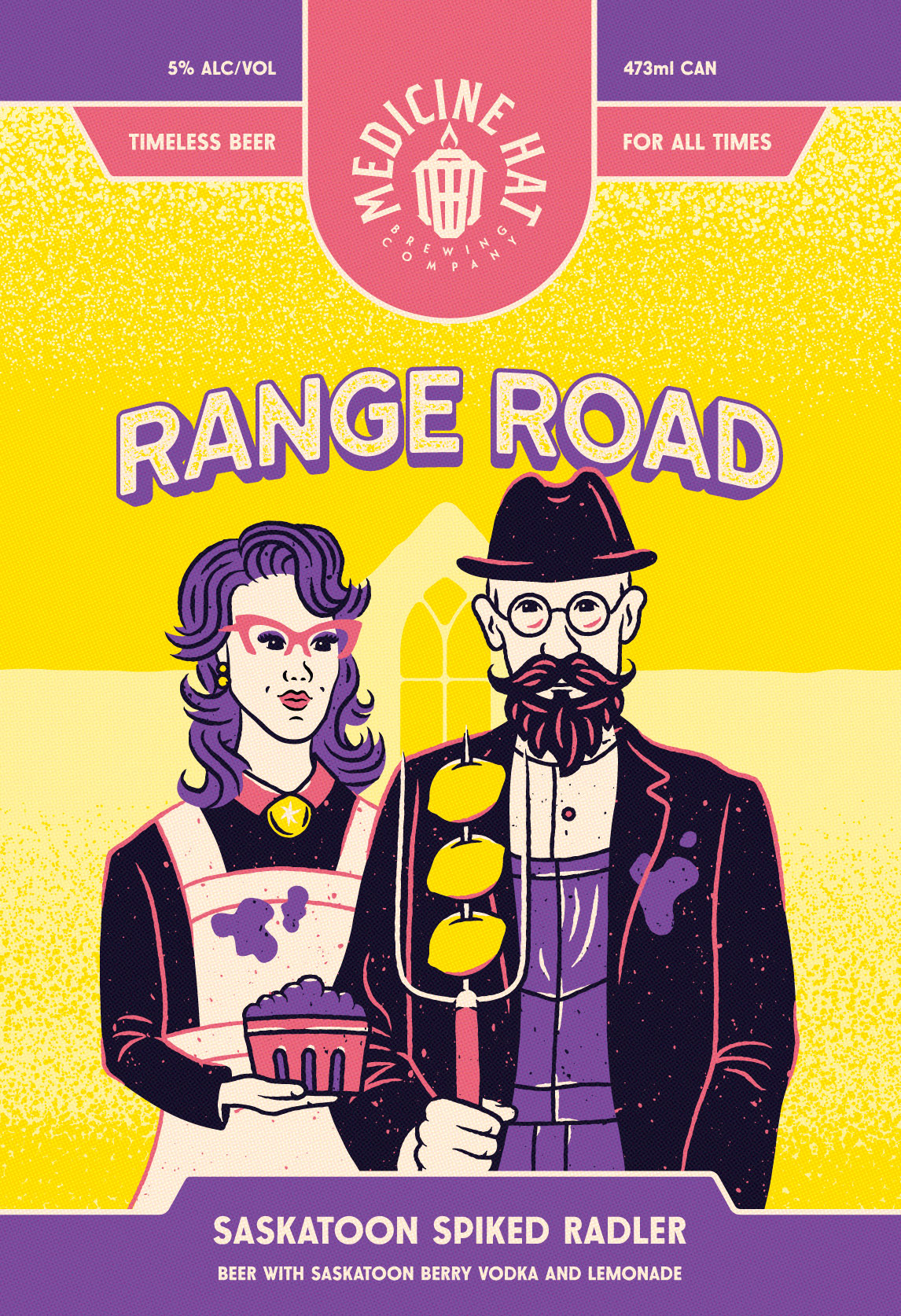
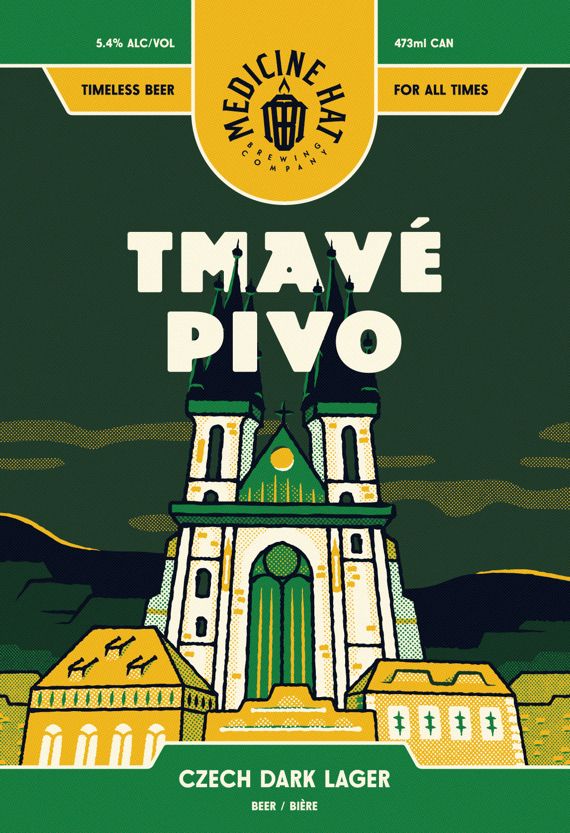
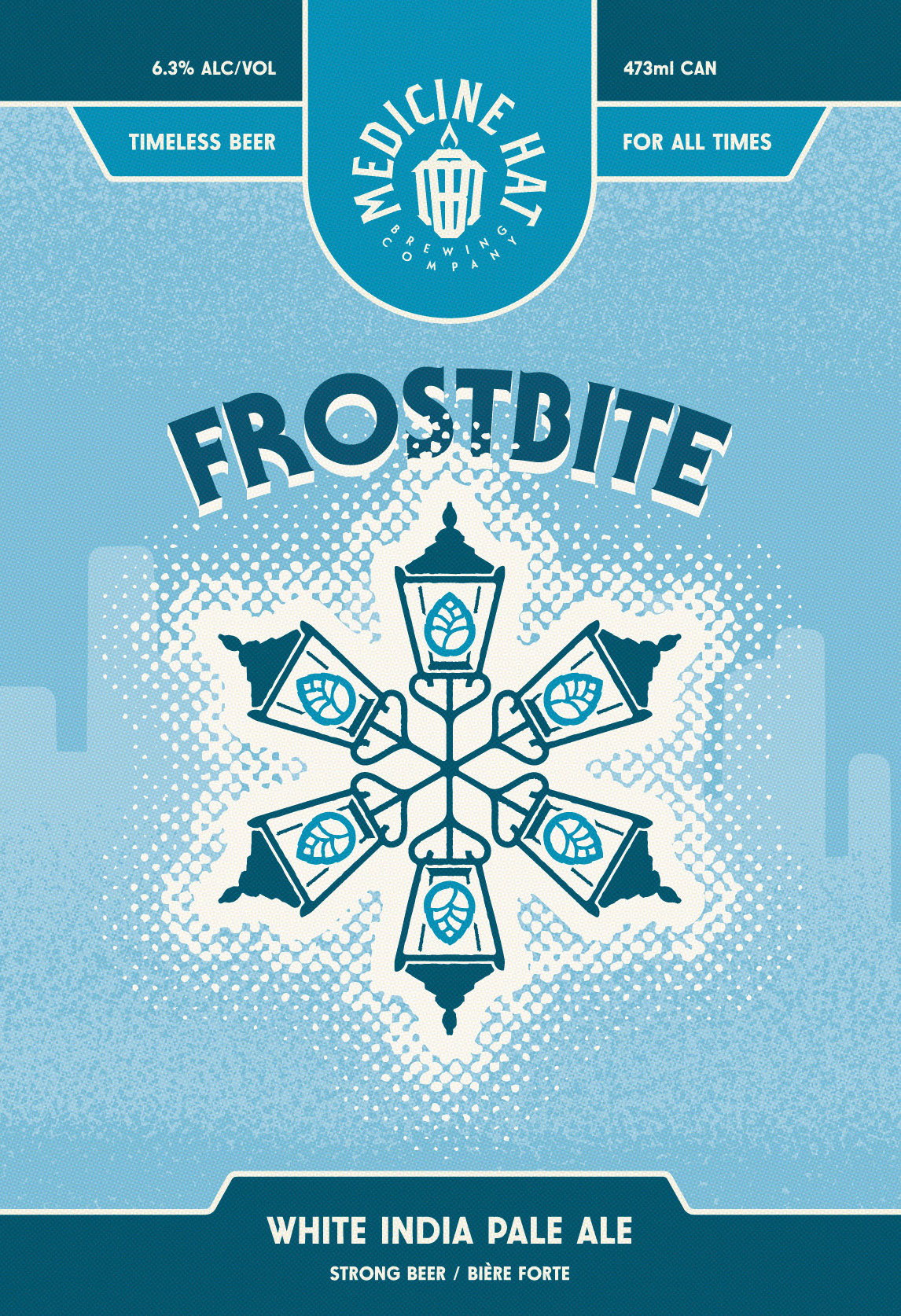
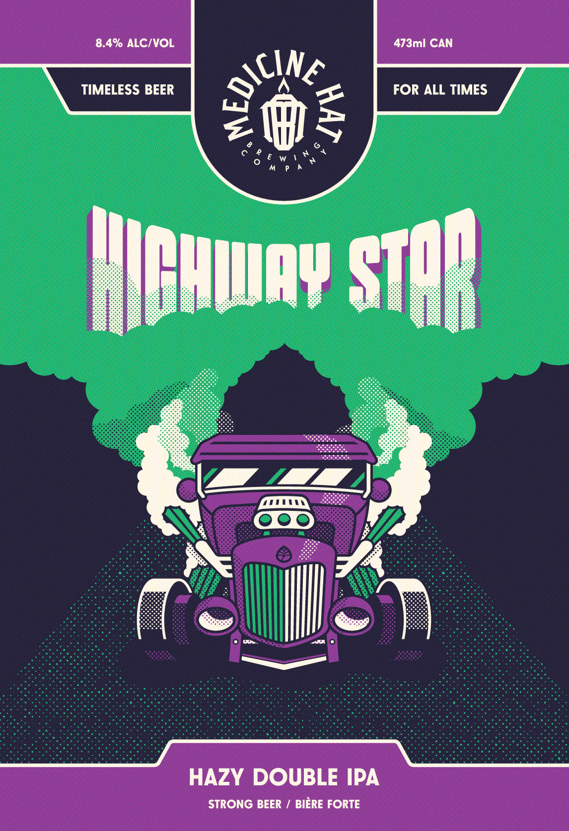
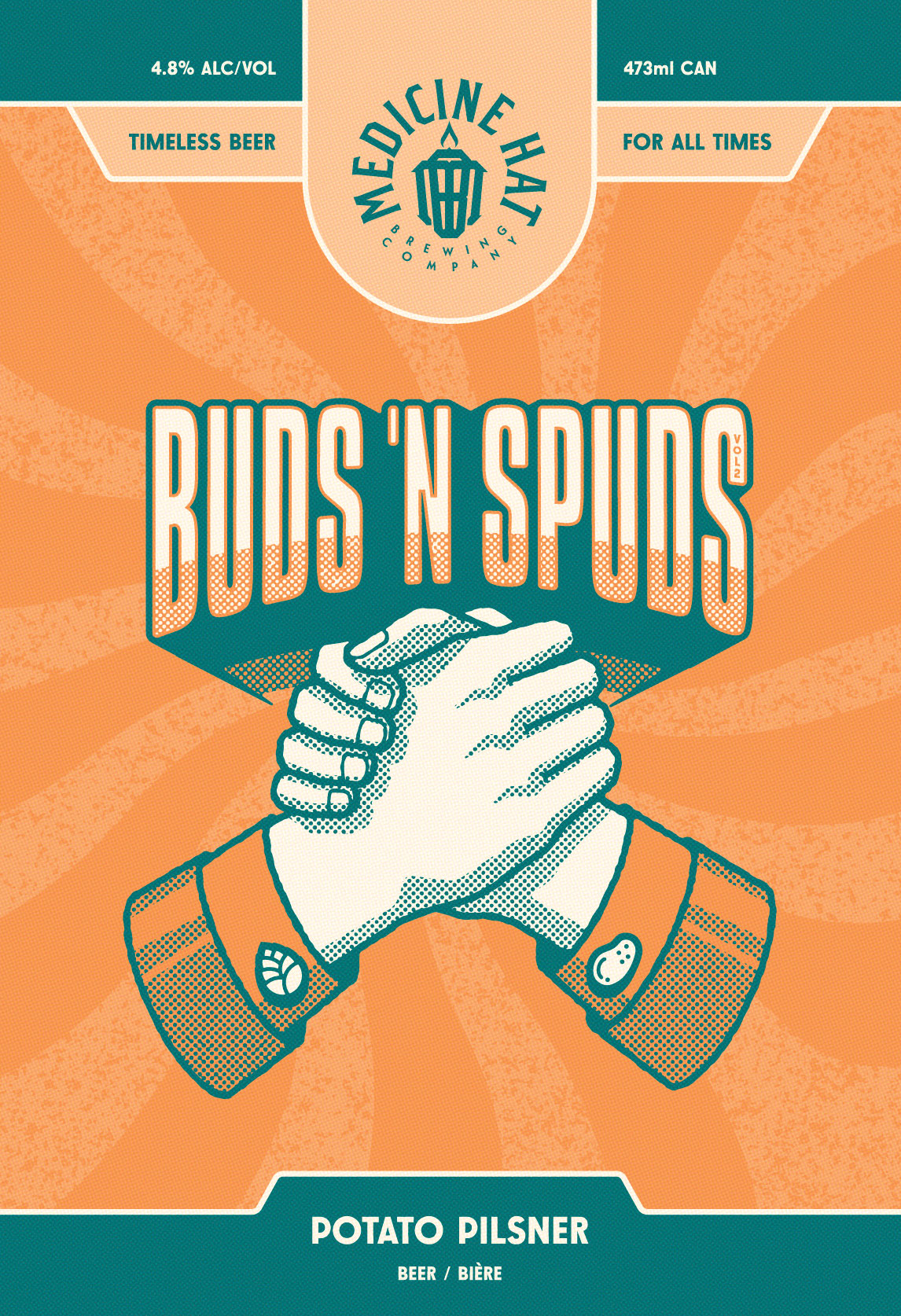
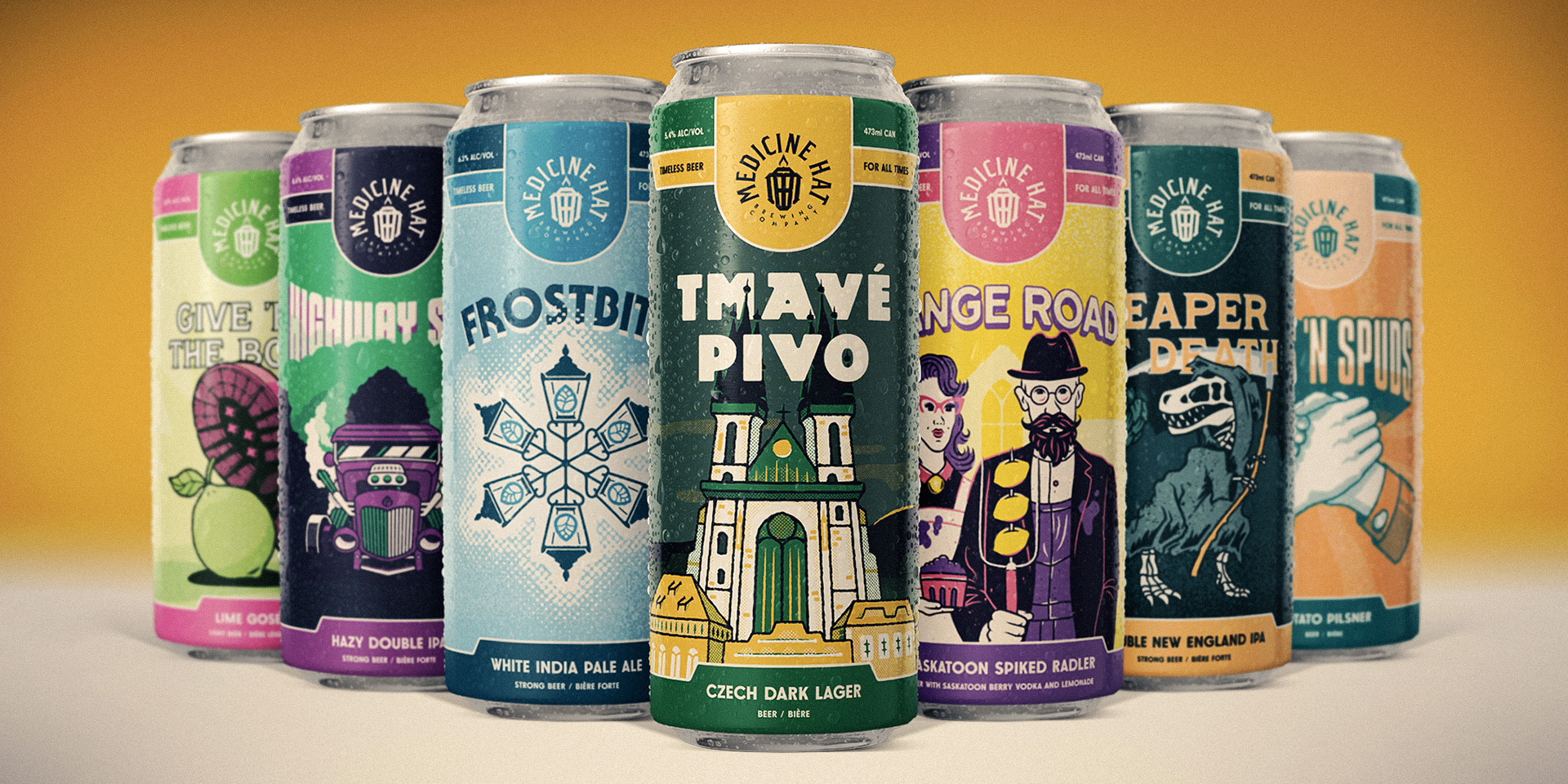
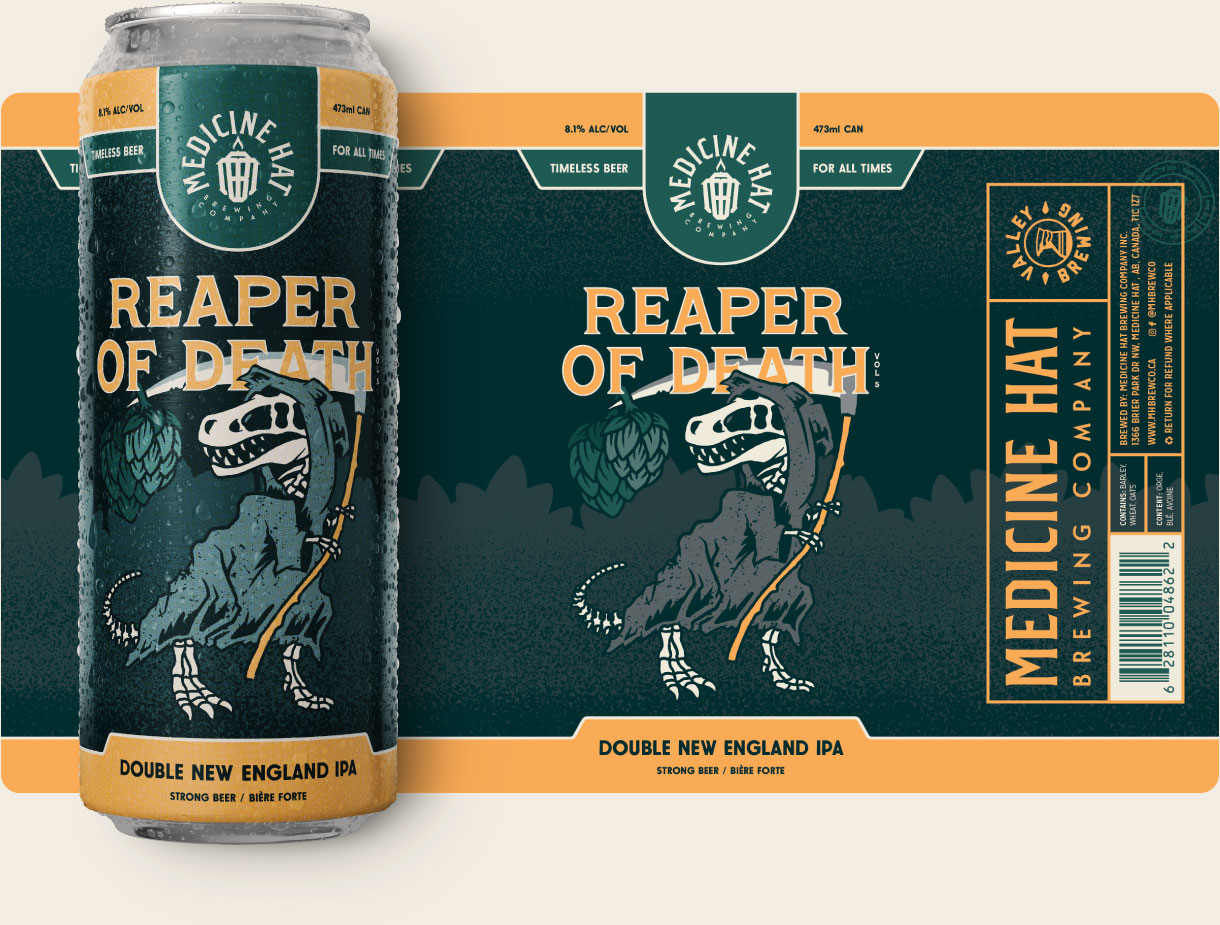
Selected beer labels
Label Template
When your product is on a shelf, you need to accomplish three things:
- Make sure there is a strong connection between your previous marketing and your packaging through your brand identity. Your brand will feel familiar to your potential customer.
- Build future brand recognition through consistent use of distinctive brand assets. This will allow your potential customer to always recognize your products at a quick glance.
- Create contrast between you and your competitors. This will help you get enough of your potential customers' attention to have them pick your product off the shelf.
For unboxed beer cans, the label becomes responsible for meeting these goals. Creating a consistent label structure designed around strong brand identity will not just help with getting your beer picked up off of the shelf once, but remembered for future visits to the liquor store.
We created a framework that features the Medicine Hat Brewing Company logo (designed by Hired Guns Creative), a tagline, and the necessary beer information on the front face of the can. By repeating the front face of the can twice, we increase the probability that the front face of the can is facing the potential customer. (You can't always control how your beer is going to be placed on a shelf.)
We completed the label structure with a back face that not only holds the required packaging information, but another instance of MHBC's logo. A logo will always be visible no matter the rotation of the can, helping to build a brand stronger than a single beer.
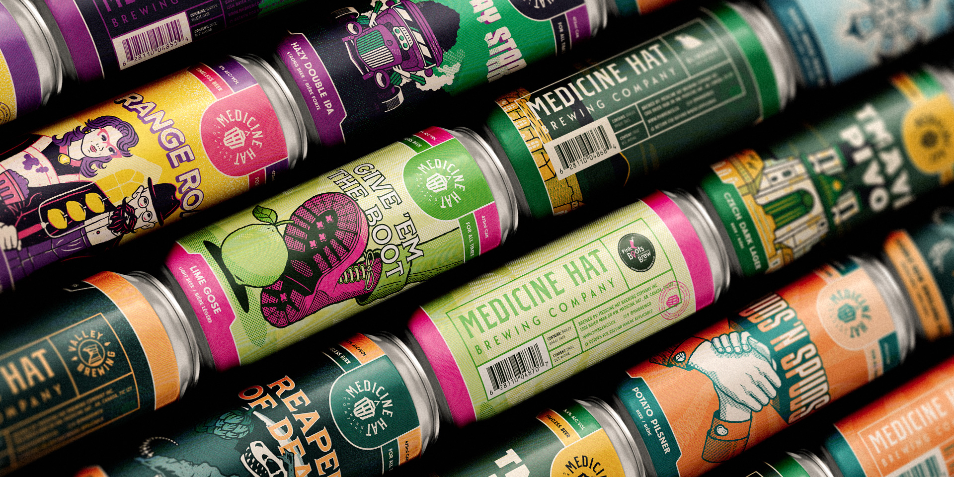
Label Illustrations
No matter the flavour or name of the beer, we created an illustration style that stays consistent to help reinforce MHBC's visual identity.
Bold, playful typography placed just underneath the MHBC logo makes each label feel like its own poster.
Each illustration is created mimicking traditional screenprinting techniques. Grungy halftone patterns and rough line-work give each illustration a tactile, timeless look-and-feel.
MHBC's goal is to create timeless beers. We created illustrations to match.