COUNCIL COFFEE
Complete Branding
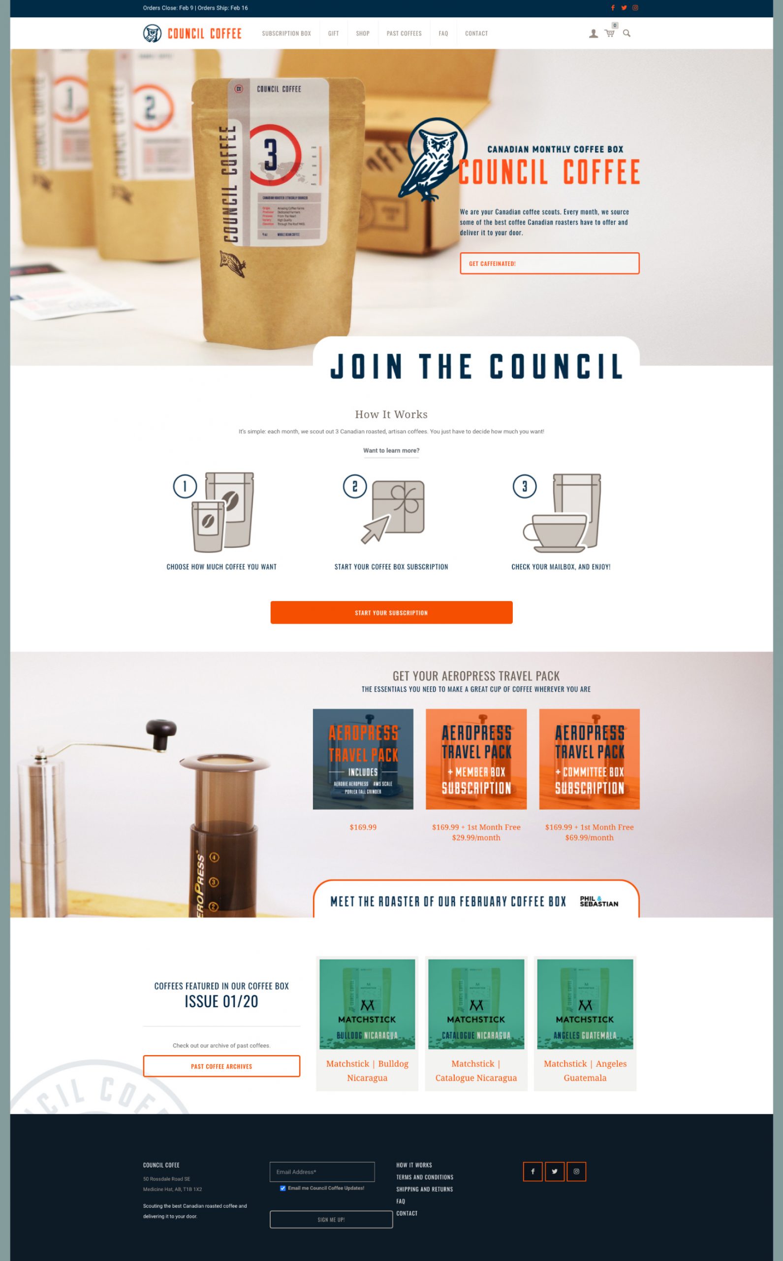
Council Coffee is a Canadian coffee subscription company. With so many coffee roasters to choose from, Council Coffee wanted to eliminate their customers' risk of drinking bad coffee and surprise them with different, exciting, ethically sourced coffees from Canadian roasters each month. With an online monthly subscription model, Council Coffee needed a brand that its customers would be loyal to.
Client | Council Coffee |
Date | November 2017 |
Scope | Brand Strategy |
| Verbal Identity | |
| Visual Identity | |
| Packaging Design | |
| Website |
Project Goal
Create branding that:
- Has a strong community feel where customers are welcome and included.
- Places an emphasis on educating their customers in everything coffee.
- Coffee roasters who sell ethically sourced coffee can be proud to partner with.
Target Audience
The Council Coffee branding needs to target two different audiences:
- The coffee fan who needs a guide through the complex world of coffee.
- The highly enthusiastic athlete who drinks coffee as a part of their dietary regimen.
The Name
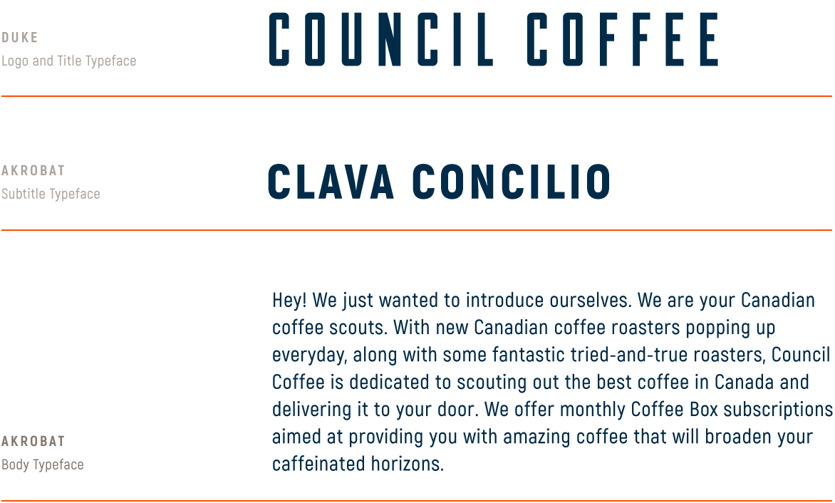
Wanting a word that could represent the group the customers would be a part of, Council had the right balance of gravity to express the high quality of the coffee, and the sense of community the customers would participate in. On a technical level, the alliteration of Council Coffee helps make the name memorable. And the balance of two syllables per word makes the name easy (maybe even bouncy and fun) to say.
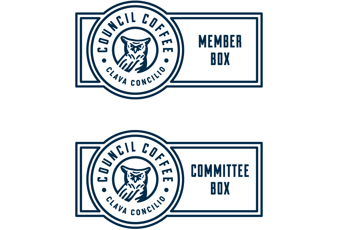
Horizontal Logo Alternates
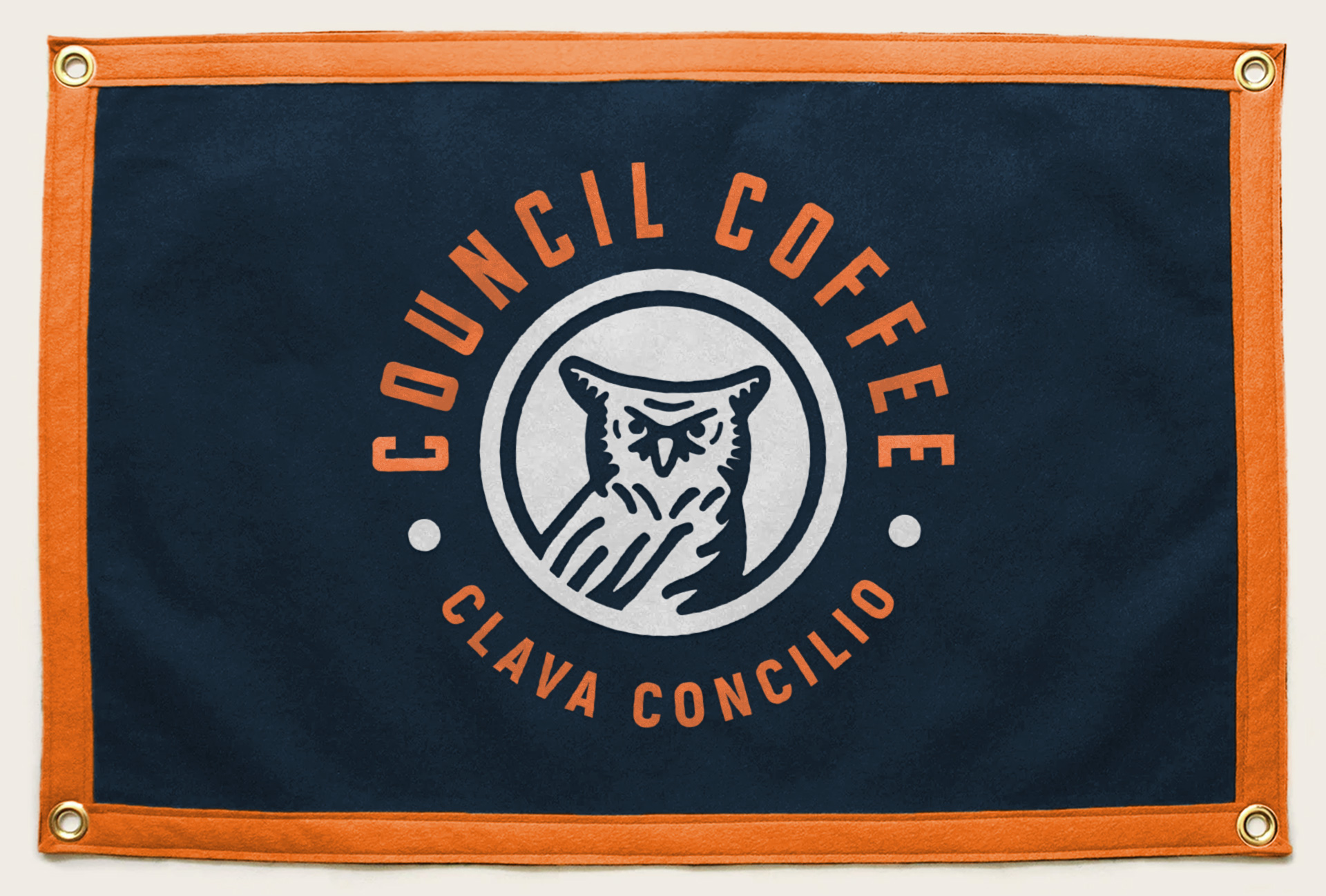
The Visual Identity
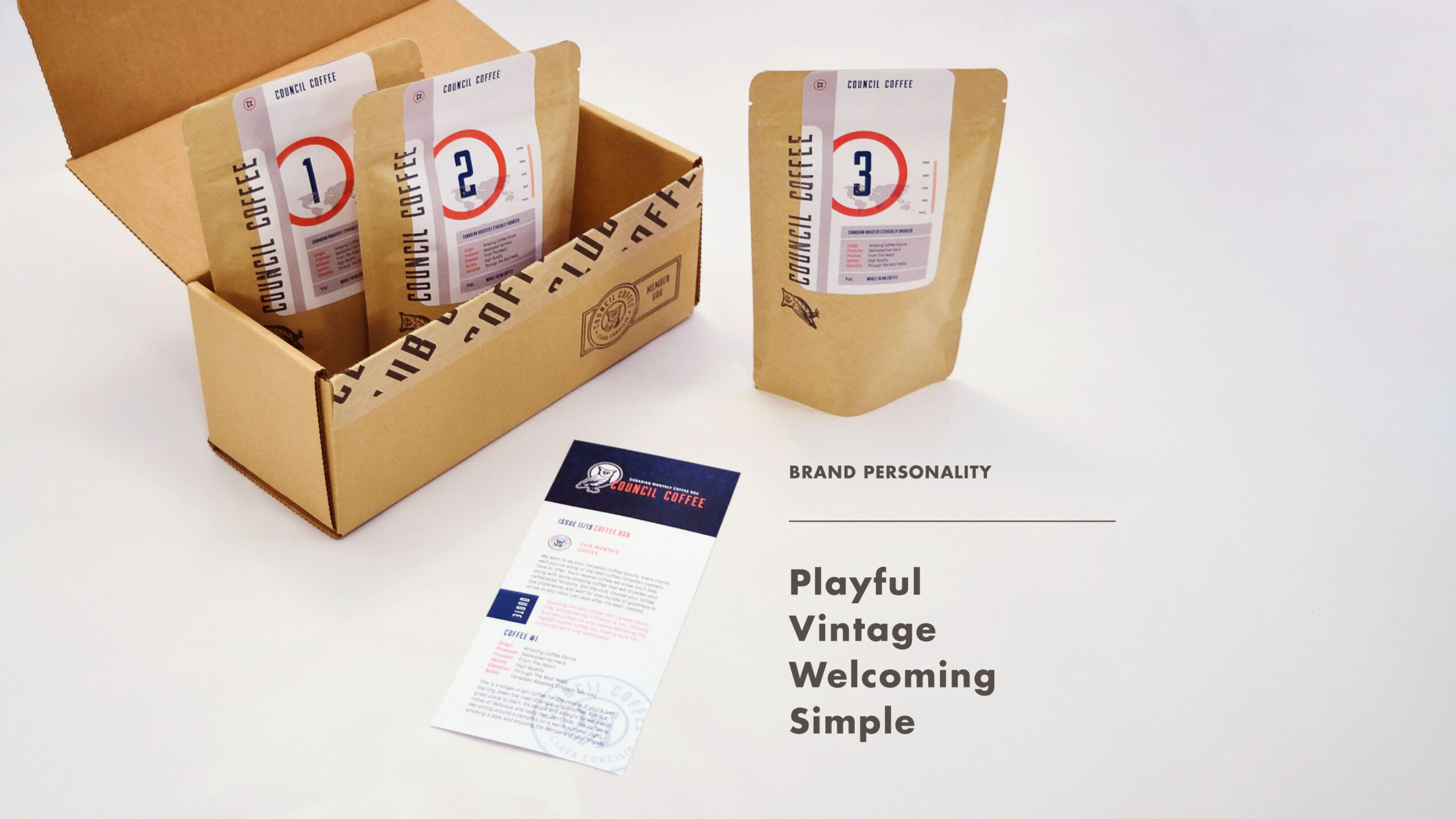
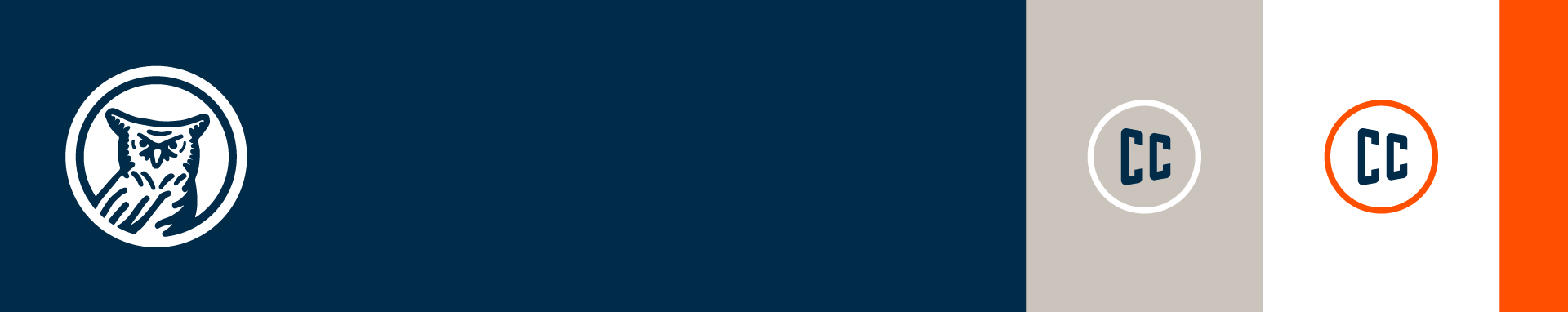
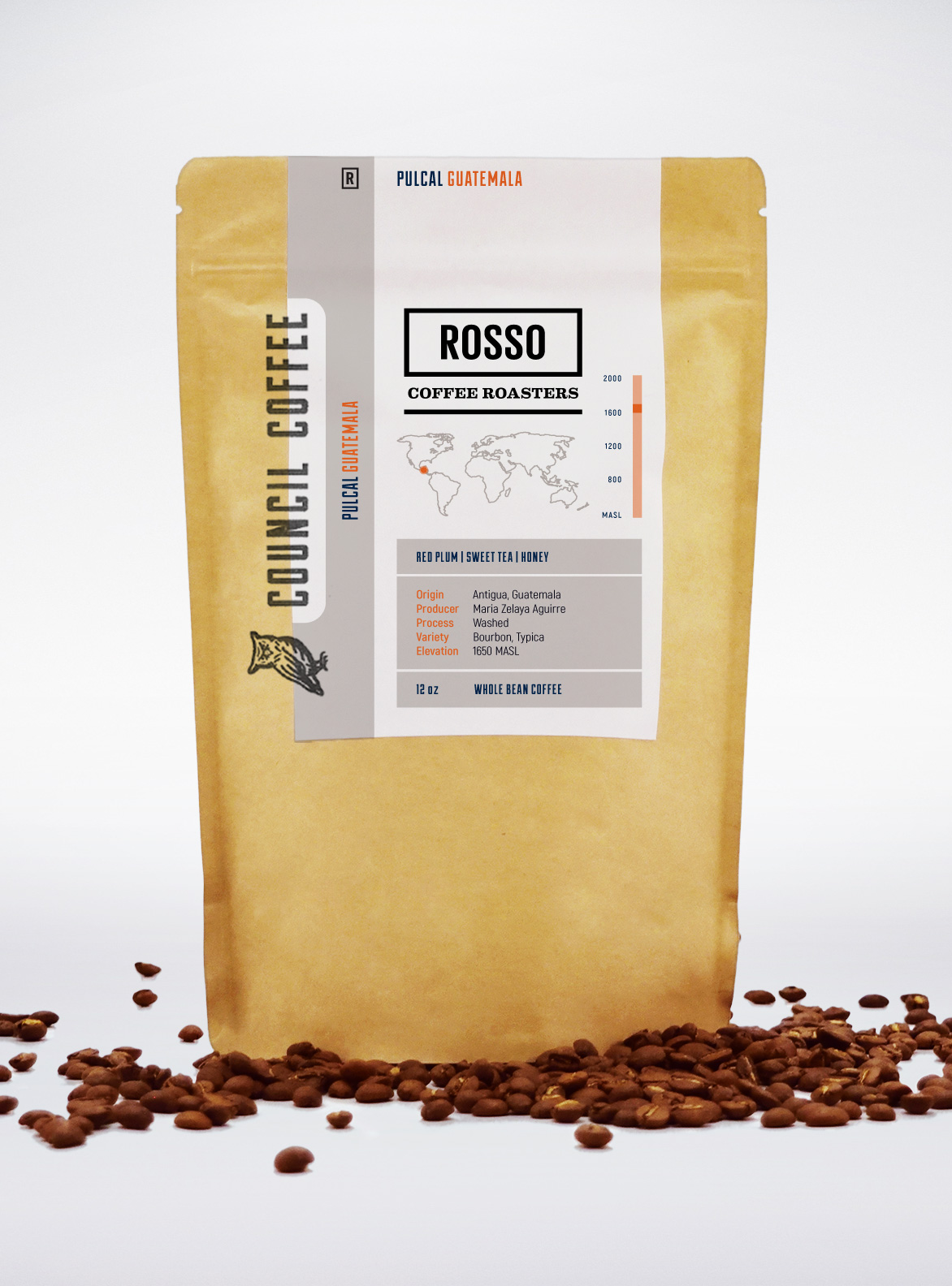
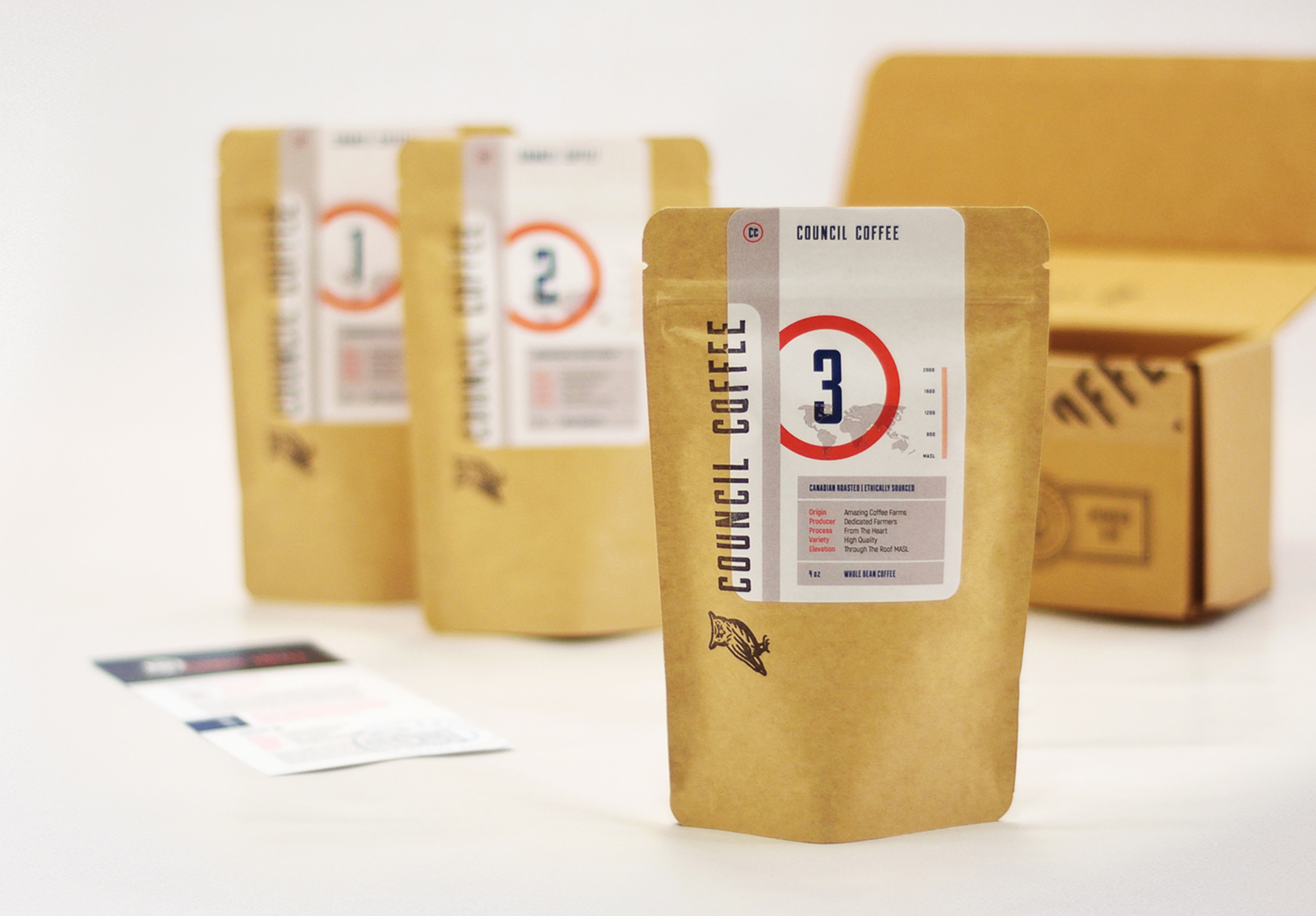
To build out the playful, vintage feel that Council Coffee needed, we created a suite of icons and badges. Not only did this start to bring life to the university athletics aesthetic, but, on a technical level, this gave Council Coffee a range of distinctive assets that be used at extremely small and large sizes.
We then developed a simple colour palette that we could see being used as the colours of football jerseys from the early 1900s. And, of course, we needed to utilize the felt texture of a vintage pennant or banner.
For our wordmark and display typography, Duke (designed by James T. Edmondson) is built from simple, geometrical shapes that you can imagine being cut out of felt and stitched onto a pennant or jersey. The Akrobat font family shared a lot of similarities to Duke, while bring a lot of versatility to the visual identity to be an effective subtitle and body typeface.
The Application
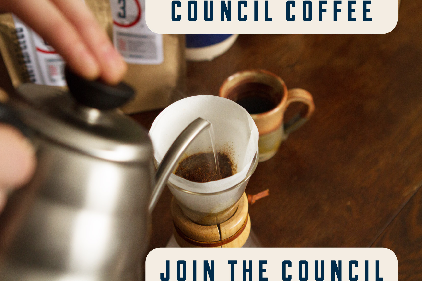
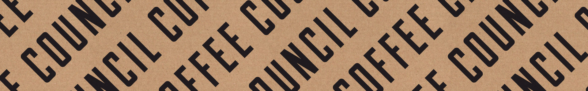
Since Council Coffee is an online coffee subscription start-up, packaging and an online store were the two biggest components that needed to be designed (and on a budget, to boot). Ethical business practices are close to the heart of Council Coffee, so they wanted the packaging to be recyclable. In order to accomplish that goal on a budget, we decided to design some stamps to use on our boxes and coffee bags and fully embrace the brown kraft look and feel.

"Kyle at Middlename did a fantastic job with us at Council Coffee. Working together, he helped us create a cohesive brand that had consistent messaging through design, marketing materials, and photography. He was fantastic to work with, and guided us through making decisions about our brand that we weren't aware of at the start."
- Joey Heinrichs,
Owner at Council Coffee