BLACK ALDER

Visual Identity Design

Black Alder is a custom carpentry company that turns finishing carpentry into an art. Taking a natural object like wood and coercing it into perfect, geometric forms seems like some kind of alchemy. This is the kind of magic Black Alder does, adding the unique finishing touches that turn people's houses into homes. And it's the same kind of magic we tried to capture in Black Alder's visual identity.

In October 2020, Black Alder was just getting established as a new business. So the primary goal for Black Alder's visual identity project was not just to get the attention of homeowners and home builders, but to convey the craftsmanship and imagination it takes to bring custom finishing carpentry to life.

Client
Black Alder
Date
October 2020
   
Scope
Logo
  Visual Identity
  Visual Identity Guidelines Booklet
  Business Cards
  Vehicle Decals

BLACK ALDER

Visual Identity Design

Black Alder is a custom carpentry company that turns finishing carpentry into an art. Taking a natural object like wood and coercing it into perfect, geometric forms seems like some kind of alchemy. This is the kind of magic Black Alder does, adding the unique finishing touches that turn people's houses into homes. And this is the kind of magic we tried to capture in Black Alder's visual identity.

In October 2020, Black Alder was just getting established as a new business. So the primary goal for Black Alder's visual identity project was not just to get the attention of home owners and home builders, but to convey the craftmanship and imagination it takes to bring custom finishing carpentry to life.

Client
Black Alder
Date
October 2020
   
Scope
Logo
  Visual Identity
  Visual Identity Guidelines Booklet
  Business Cards
  Vehicle Decals

Project Goal

Create a visual identity that:

  • Combines references to the natural, organic nature of wood and the geometric, controlled way wood gets used in finishing carpentry.
  • Portrays the personality traits of being sincere, crafted, refined, and imaginative.
  • Represents the quality of craftsmanship needed for high-end finishing carpentry.

Target Audience

The Black Alder brand needs to target two different audiences:

  • The local homeowner that wants to upgrade their home.
  • The local home building companies that need a high-quality finish.

Project Goal

Create a visual identity that:

  • Combines references to the natural, organic nature of wood and the geometric, controlled way wood gets used in finishing carpentry.
  • Portrays the personality traits of being sincere, crafted, refined, and imaginative.
  • Represents the quality of craftsmanship needed for high-end finishing carpentry.

Target Audience

The Black Alder brand needs to target two different audiences:

  • The local homeowner that wants to upgrade their home.
  • The local home building companies that needs a high-quality finish.

The Logo

The Logo

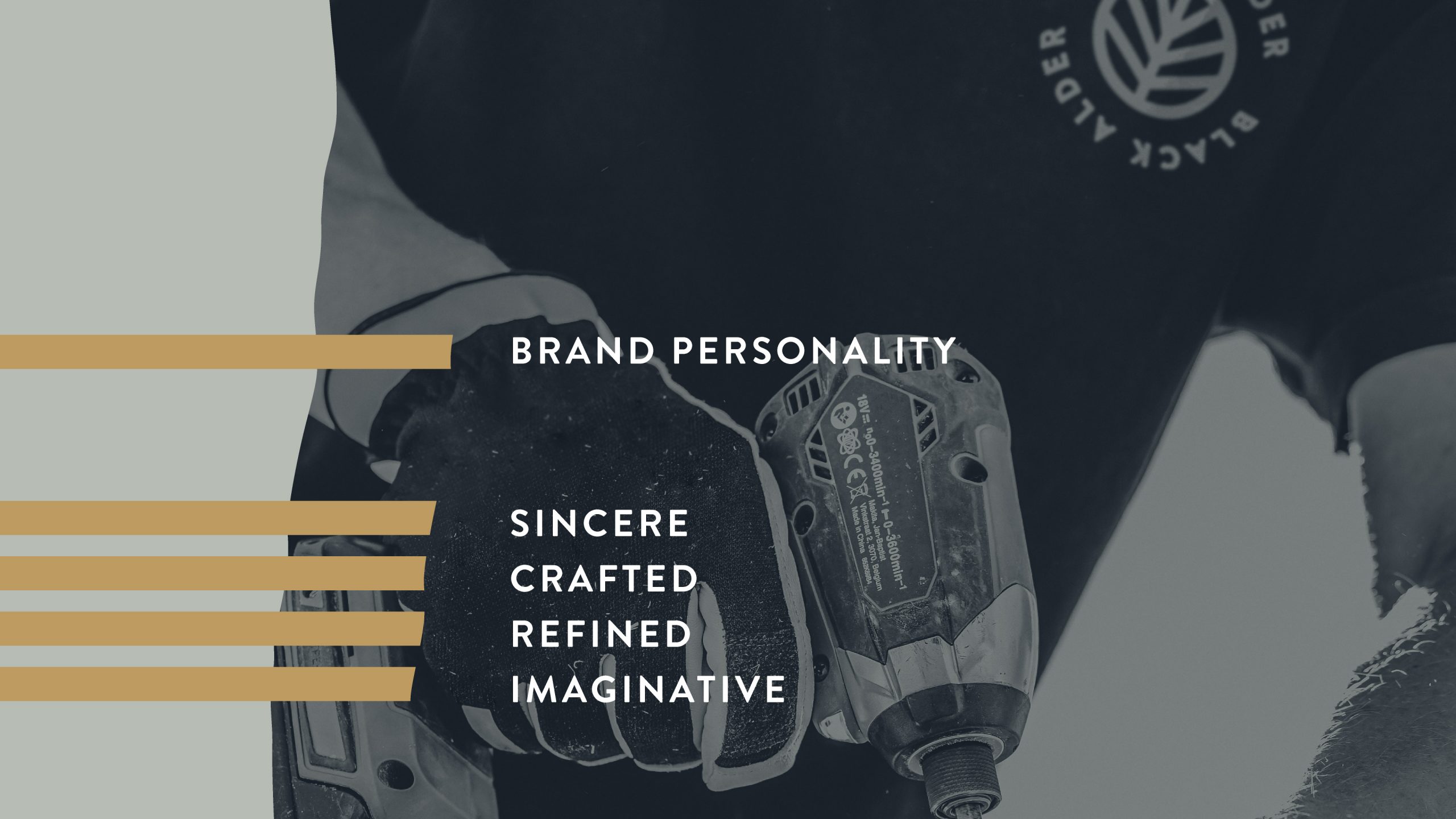
To reinforce the sincerity and straightforwardness of the Black Alder brand, we landed on the concept of the black alder leaf as the icon that would anchor this visual identity. Black Alder trees have almost circular leaves, allowing us to create a geometric symbol of something that is truly organic. We also drew the veins of the black alder leaf in a way that suggests a corner in perspective, referencing the idea of wood joinery.

Black Alder Suite of Logos

The Visual Identity

To support the logo and reinforce the organic nature of the brand, we created a series of shapes and textures based on wood grain that can be overlapped to create collages and patterns.

Although designed in 2009 by Hannes von Döhren, the Brandon Grotesque typeface had the mid-century modern geometry we wanted to balance the visual identity. The humanist nature of Akzidenz-Grotesk, a typeface originally released by the Berthold Type Foundry, added a simple and sincere character to the body copy.

With a leaf as the star of the visual identity, we wanted a colour palette that represented the seasons to be able to push and pull the emotions of the Black Alder visual identity.

The Visual Identity

To support the logo and reinforce the organic nature of the brand, we created a series of shapes and textures based on wood grain that can be overlapped to create collages and patterns.

Although designed in 2009 by Hannes von Döhren, the Brandon Grotesque typecface had the mid-century modern geometry we wanted to balance the visual identity. The humanist nature of Akzidenz-Grotesk, a typeface originally released by the Berthold Type Foundry, added a simple and sincere character to the body copy.

With a leaf as the star of the visual identity, we wanted a colour palette that represented the seasons to be able to push and pull the emotions of the Black Alder visual identity.

Application

Application

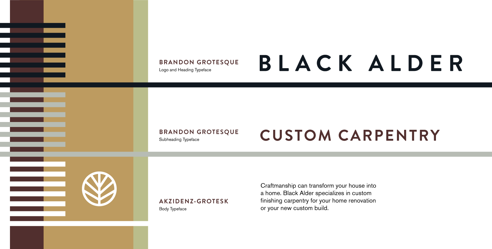
Sometimes a logo or icon just needs to be slapped onto some brand materials. And sometimes a visual identity needs to express creativity and adaptability. The big idea behind the visual identity elements was to be able to shuffle up the decorative elements and colours to create collages of natural and geometric elements. This would express the craftsmanship and imagination of the Black Alder brand while letting it be simple and sincere when needed.

With the Black Alder business card, we started with the idea of how you can see light through an actual leaf when held up to the sun. Since we were dealing with a physical object, we wanted to incorporate the physical layering that happens when creating a collage. Adding the vellum sleeve to the business card became a playful way to combine those ideas and interact with the card, completing the icon and revealing information as you slide the sleeve back and forth.

"We approached Middlename to help us with branding for a new business. Kyle was so encouraging. He made the process seamless and we never felt intimidated during our meetings. He was somehow able to put everything we wanted and could never articulate on paper, and created a brand identity that aligned with our character and personality. Middlename will always be our #1 choice for branding."

- Traci Knodel, Owner at Black Alder

Yep. Let's start a project!Yep. Let's start a project!
Not yet. I have some questions.Not yet. I have some questions.
Yep. Let's start a project!Yep. Let's start a project!
Not yet. I have some questions.Not yet. I have some questions.