AUGGIE BEVERAGES
Complete Branding
Hops and people have something in common. They can both be a little judgy. But if that's their vibe, who cares? That pure cool-breeze-on-a-hot-summer-day has got your back. And it's not just some kind of alcohol-free substitute that makes you want the real thing. Enter Auggie Beverages.
Client | Medicine Hat Brewing Co |
Date | July 2023 |
Scope | Brand Strategy |
| Verbal Identity | |
| Visual Identity | |
| Packaging |
Brand Strategy
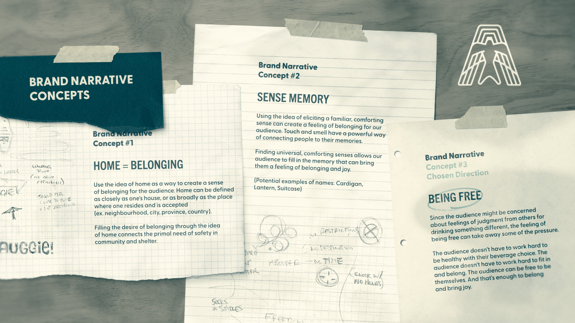
Brand New Brand
Medicine Hat Brewing Company has been in business brewing award-winning beers for seven years. Wanting to bring a unique, non-alcoholic product to market, MHBC created a Sparkling Hop Water; crisp carbonated water flavoured with refreshing hops.
During our strategy workshops, we realized that there was a large opportunity to create multiple flavours and an alcoholic line of sparkling hop waters to go alongside the non-alcoholic beverages. Since we didn't want to dilute or distort the Medicine Hat Brewing Company brand, Auggie Beverages needed to be born.
Audience and Archetype
Auggie's audience is looking for an alternative to the typical alcoholic beverages on the market; whether it's a non-alcoholic option or just a healthier one. Either way, enjoying an alternative beverage in a social setting can be potentially awkward. Fending off questions like "Why aren't you having a beer?" "Are you trying to lose weight?" or the dreaded "Are you pregnant?" is exhausting at best and alienating at its worst.
Auggie Beverages aims to serve its audience by creating a delicious, healthy, beverage for adults that isn't just a non-alcoholic version of something that already exists, but can stand strong on its own. In order to speak to their audience, Auggie Beverages took on a blend of the archetypes of "The Everyman" and "The Jester." By embodying these archetypes, Auggie can help facilitate connection for the audience by being a brand that brings a sense of belonging and joy.
Verbal Identity
The Name
Two realizations guided the strategy for the type of brand name we wanted to create:
1. There's a good chance that the first time Auggie's customers and audience try a sparkling hop water, it will be one made by Auggie Beverages. Can we get the audience to use the new brand name as a substitute for "hop water?"
2. The words "hop water" can create an idea in the audience's minds of a product they might not enjoy due to their past experiences with hops. Can we create a brand name that functions like a cocktail name for "hop water?"
Because of these realizations, we wanted to create a brand name that could replace the need to say "sparkling hop water."
Top Name Options
Option #1 - Chosen Direction
Auggie
An ownable augmentation of the word August. August is the lazy, relaxed, and free summer month. July is exciting and busy. But Auggie can represent those late, hot summer nights when you have nowhere to be and nothing you have to do. Just freedom.
Option #2
Raskle
An ownable augmentation of the word rascal. A rascal is a little mischievous, but joyful and good. When there are rules telling a rascal how to behave, they decide to be free and be themselves. As a rascal, you don't have to fit in and follow the "rules" 100% in order to belong.
Option #3
Loophole
A loophole is a way to work around the rules. Loophole represents the way around any awkwardness or judgment our audience may feel in a social situation. A loophole is a way to be free.
Visual Identity
The Logo
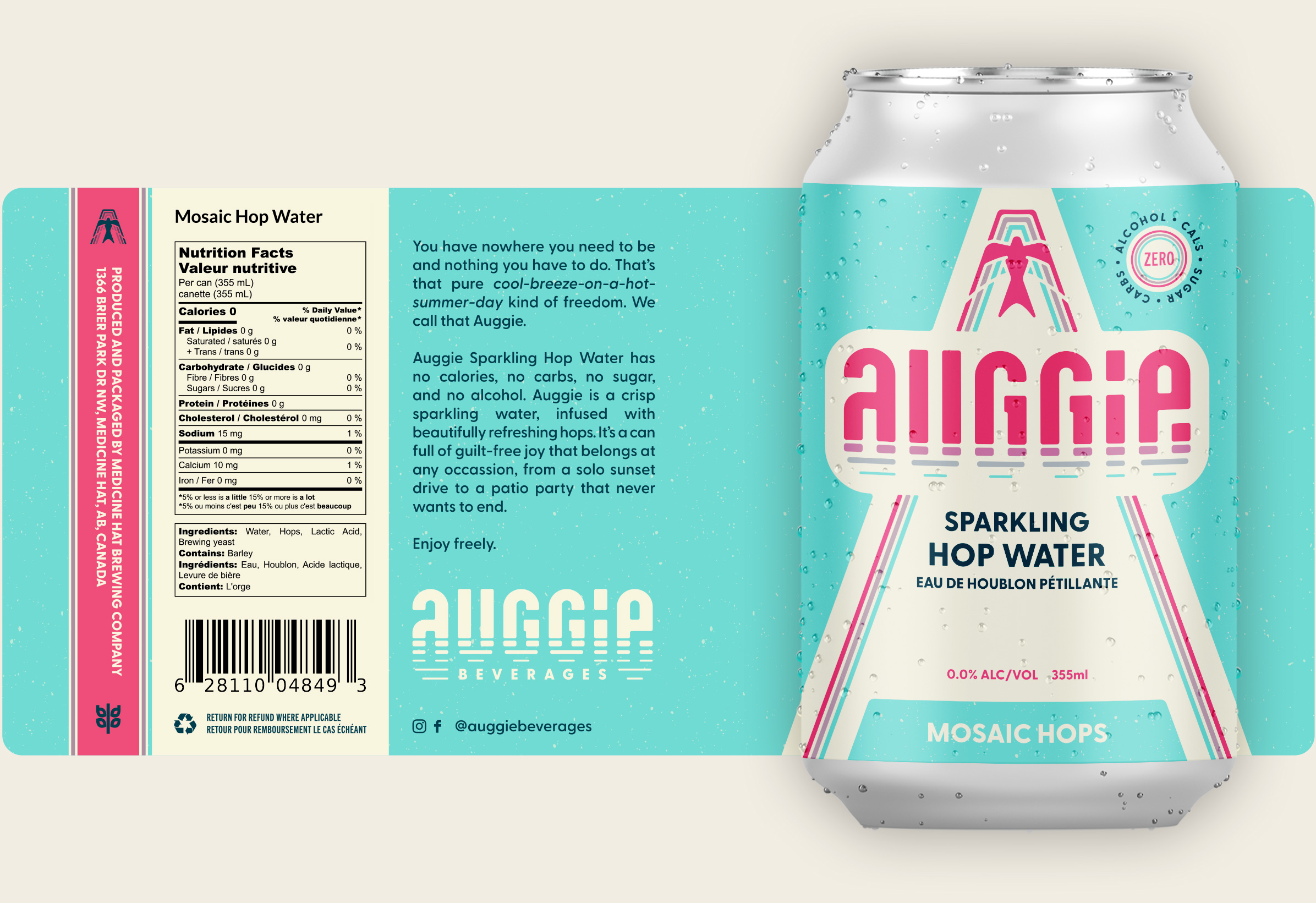
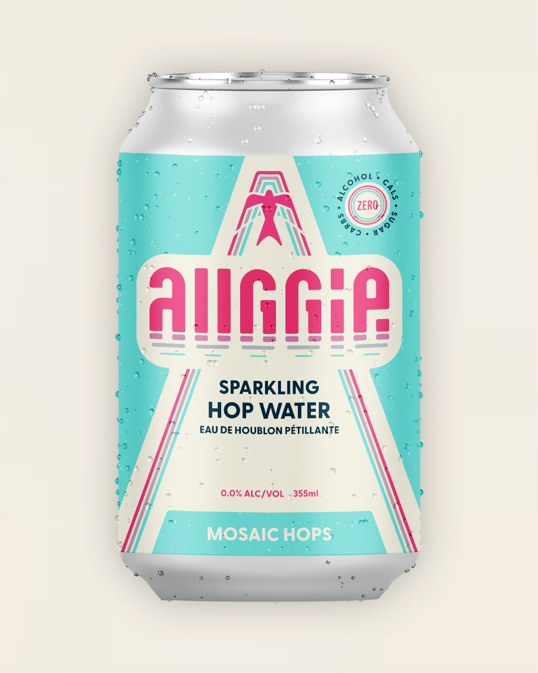
Since the strategy was to get the audience to say "Auggie" instead of "hop water," we wanted a wordmark to be the primary logo. This would give the brand name itself significant visual real estate on products, and hopefully create a memorable visual connection to the word "Auggie." Adopting this strategy also meant that we would need a secondary icon to be used in those small environments when the wordmark wouldn't be legible, like social media avatars and website favicons.
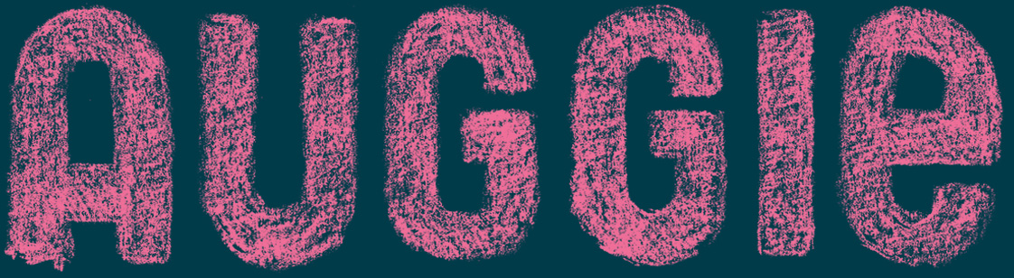
Sketch of Auggie wordmark, exploring similar shapes found in letterforms.
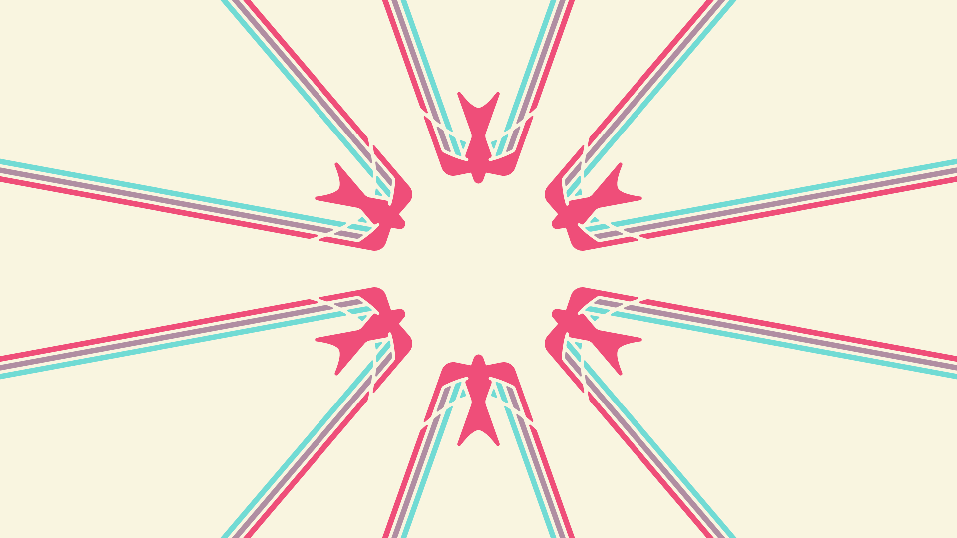
The Icon
Excited "A"
Icon Concept #1
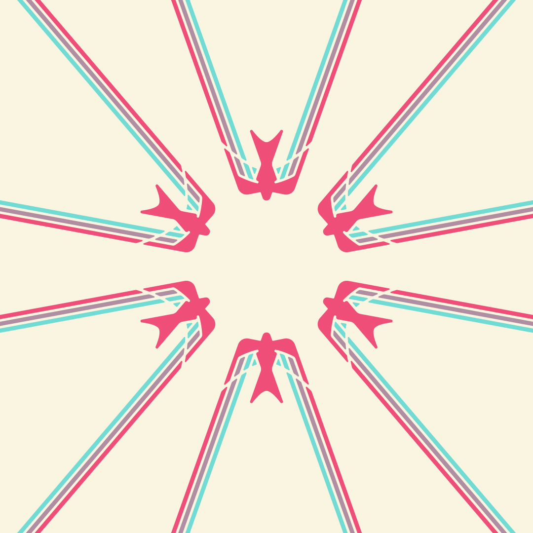
Swallow
Concept #2 - Chosen
Endless Summer
Icon Concept #3
Cowbell
Icon Concept #4
Sketches of proposed concepts for a secondary icon.
Packaging and Application
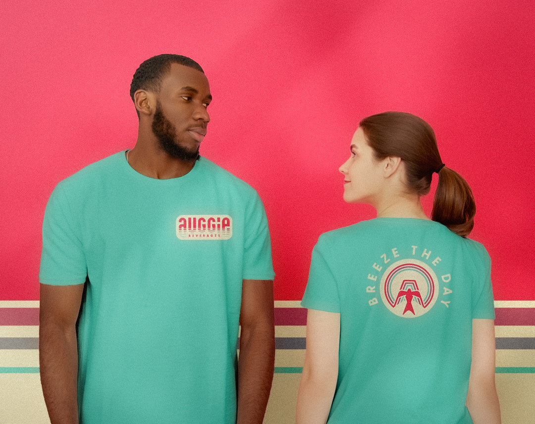
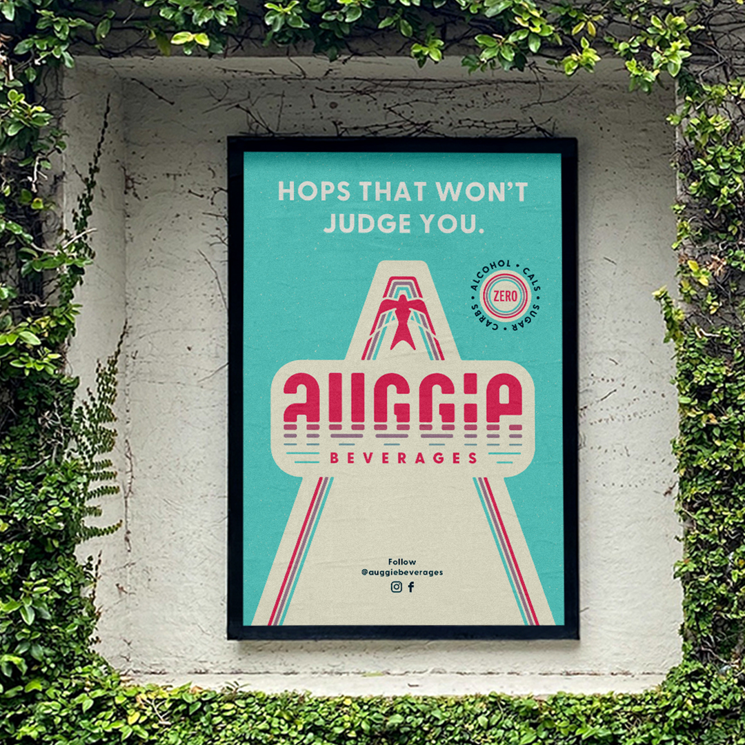
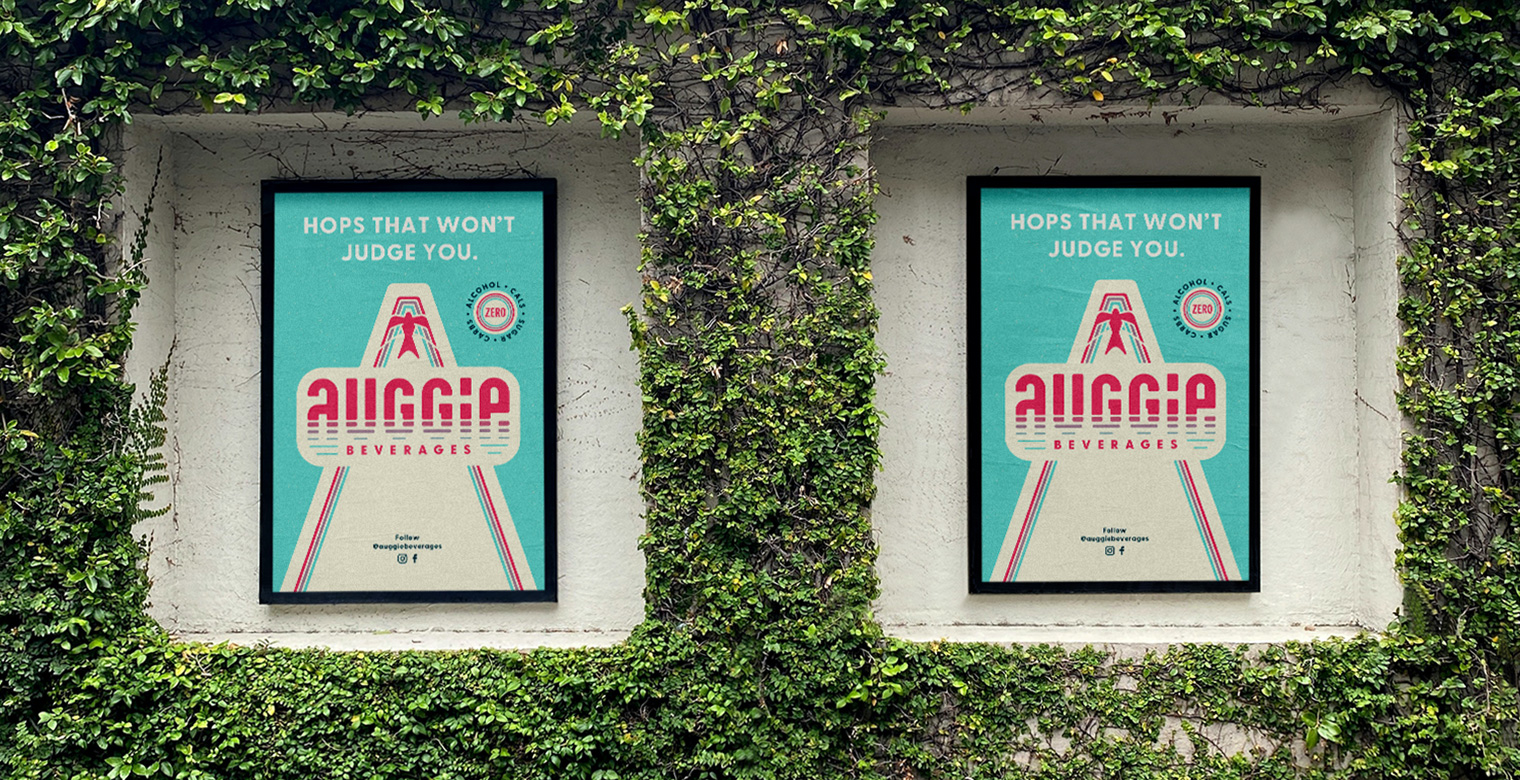
When it came to creating the can label, we knew we needed the Auggie wordmark front and centre in order to get the brand name on the audience's lips. By locking up the bird icon and the Auggie wordmark, we created a triangle frame on the front of the can to house information. But more than that, this triangle frame can become another distinctive brand asset on its own, helping a potential customer easily pick out an Auggie product on the shelf surrounded by other brands.
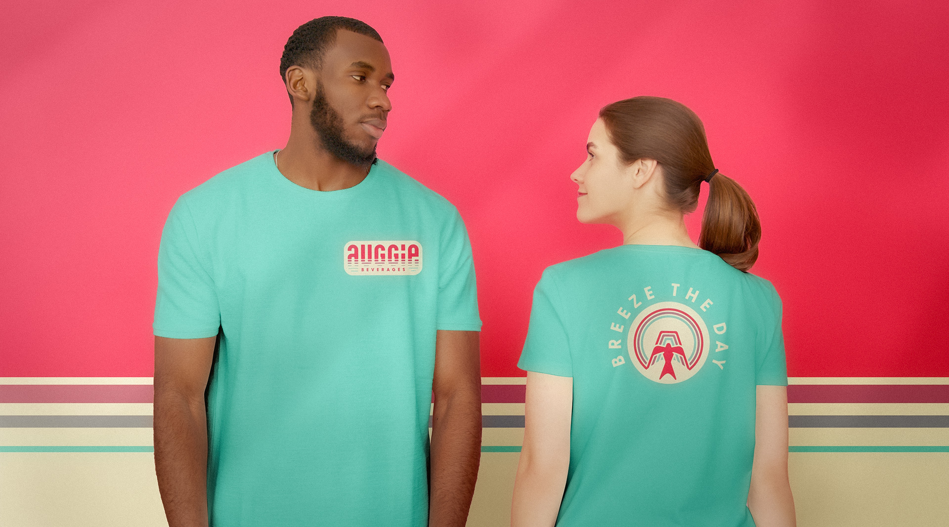
If Auggie is to be personified in the visual identity, Auggie isn't the bird. Auggie is the summer wind the bird rides on. The tagline of "Breeze the Day" became the call to (in)action. Intentional relaxation.
Even though the overall brand has a friendly vibe, we wanted the copywriting to be a little playful and cheeky. The ad headline "Hops that won't judge you" has a little bit of snark to it, but it's snark directed at those judgmental voices in our audience's lives. With Auggie, it's just pure, judgment-free, summertime freedom.
"Middlename's exceptional branding process brought our new product to life in the most captivating way. Kyle displayed a remarkable understanding of our vision and target audience, creating a brand identity that resonates deeply with our customers and aligns perfectly with our company values. Kyle’s keen eye for design and storytelling resulted in a compelling brand image. Working with Middlename was an absolute pleasure. We wholeheartedly recommend their services to anyone seeking a branding partner that truly understands and delivers on their clients’ aspirations."
Kathy Vancuren,
Owner at Medicine Hat Brewing Company