PREMIUM SAUSAGE
Brand Strategy, Visual Identity Redesign
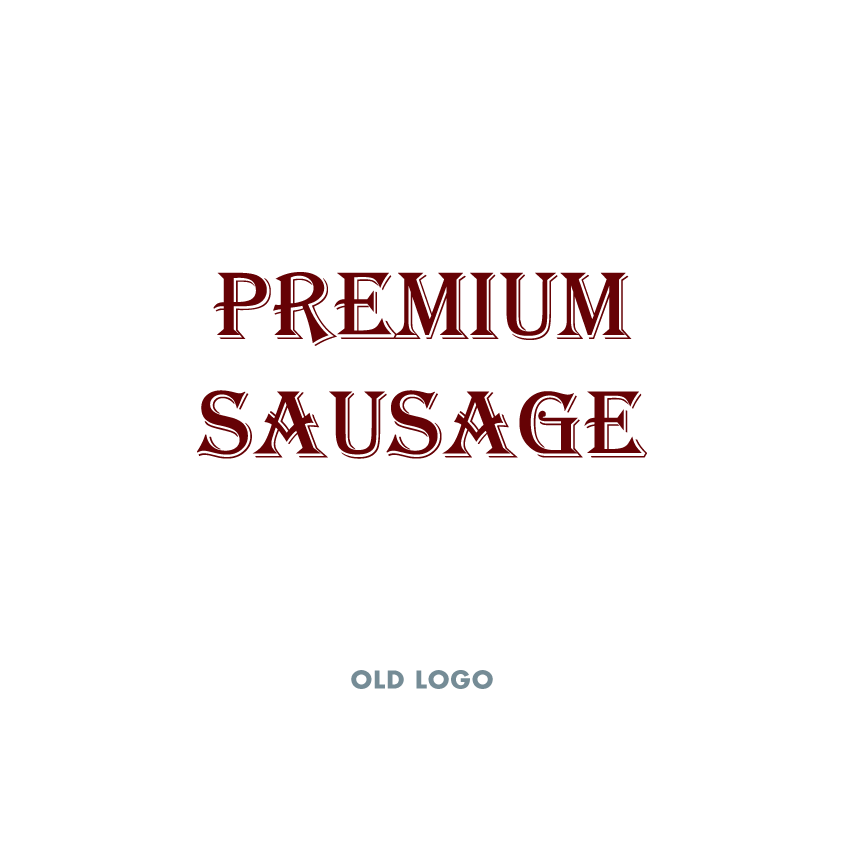
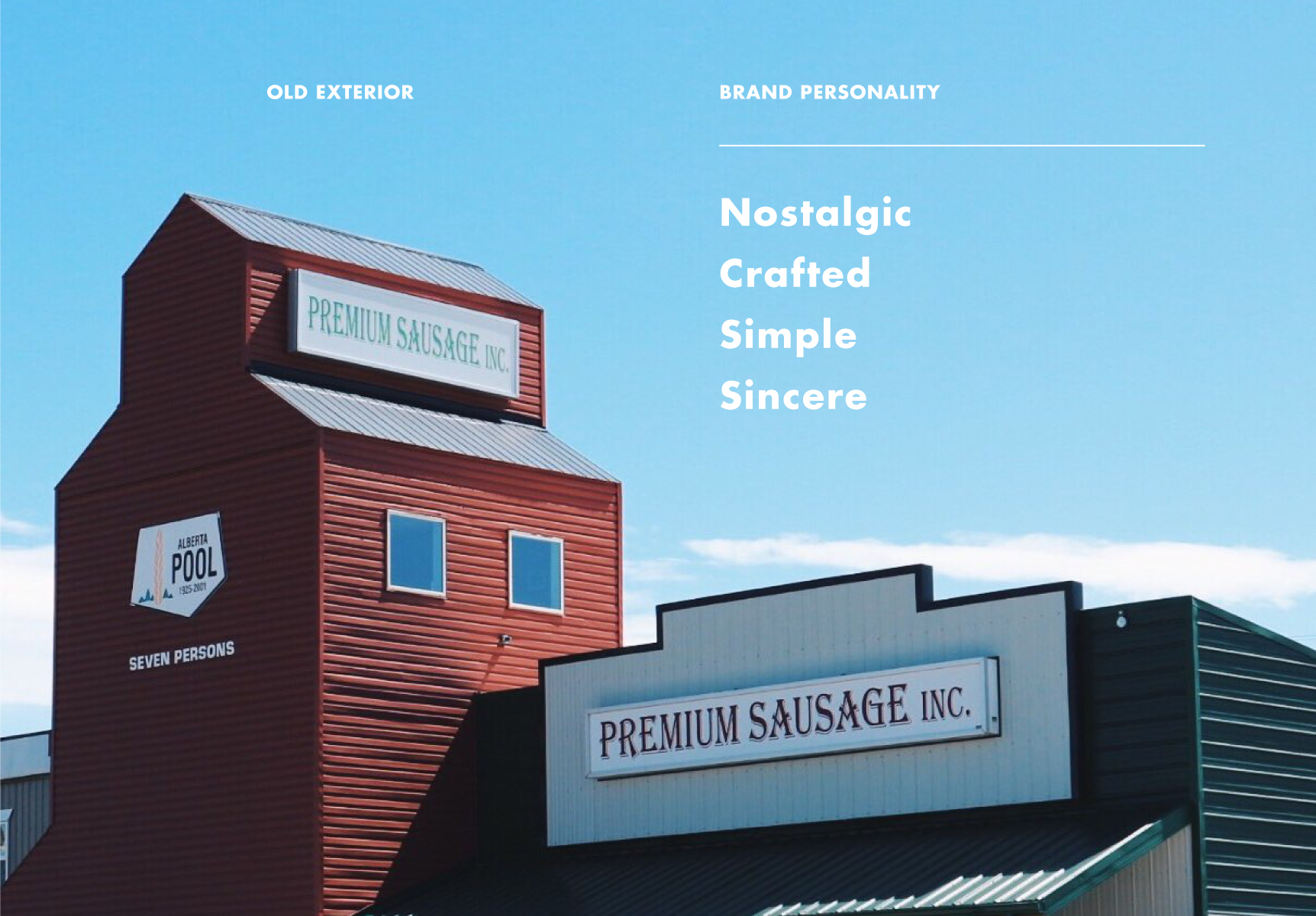
Premium Sausage is more than just a butcher shop. Along with selling meat and other sundries, they make custom to-order sausage. With a unique building in the shape of a Grain Elevator located in a small hamlet 20 kms from a mid-sized city in the Alberta prairies, Premium Sausage had built a reputation as a tourist destination but needed a way to regularly connect to the nearby locals.
The primary goal for this project was to create a visual identity that represented Premium Sausage's heritage as a business in the area for 30 years, and a brand that would connect to a wider audience.
Project Goal
Create a visual identity that:
- References the symbolism of a Grain Elevator giving the brand the personality traits of being nostalgic, crafted, simple, and sincere.
- Reaches an audience of travellers and is memorable and enticing to locals.
- Represents the quality of craft and product that 30 years of experience creates.
Target Audience
The Premium Sausage brand needs to target two different audiences:
- The hunter and family that want to get their game processed. Strong connection to hard work, self reliance, and the Prairie environment.
- The health conscious eater who cares about what's in their food. Values the craft, purity, and simplicity necessary for high quality foods.
The Logo
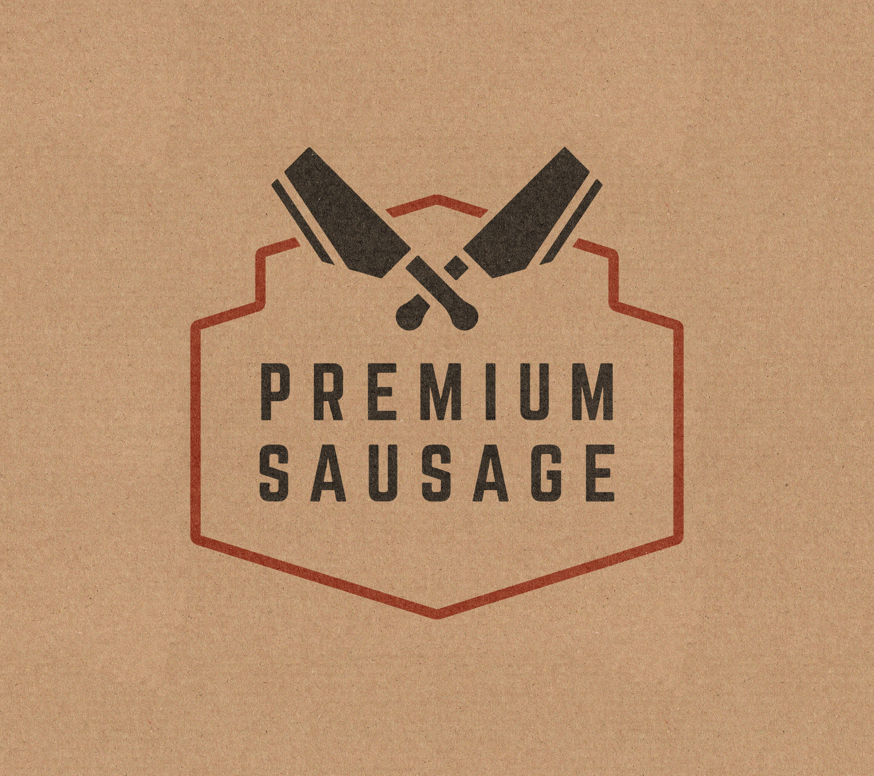
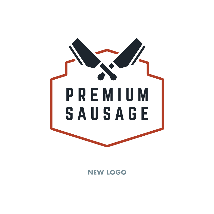
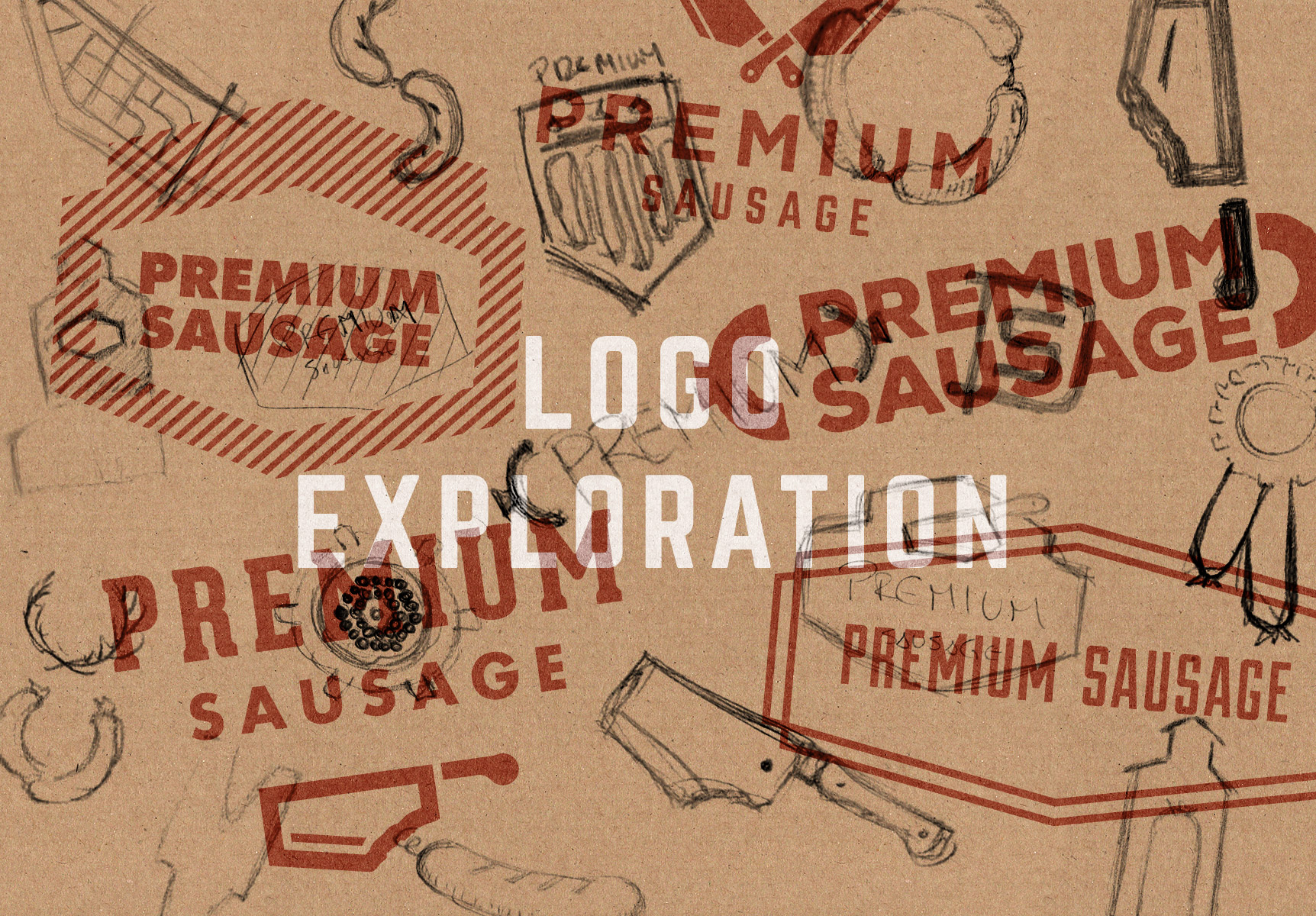
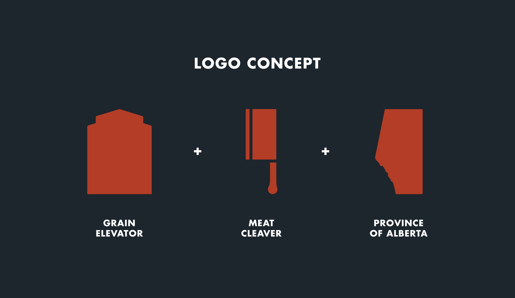
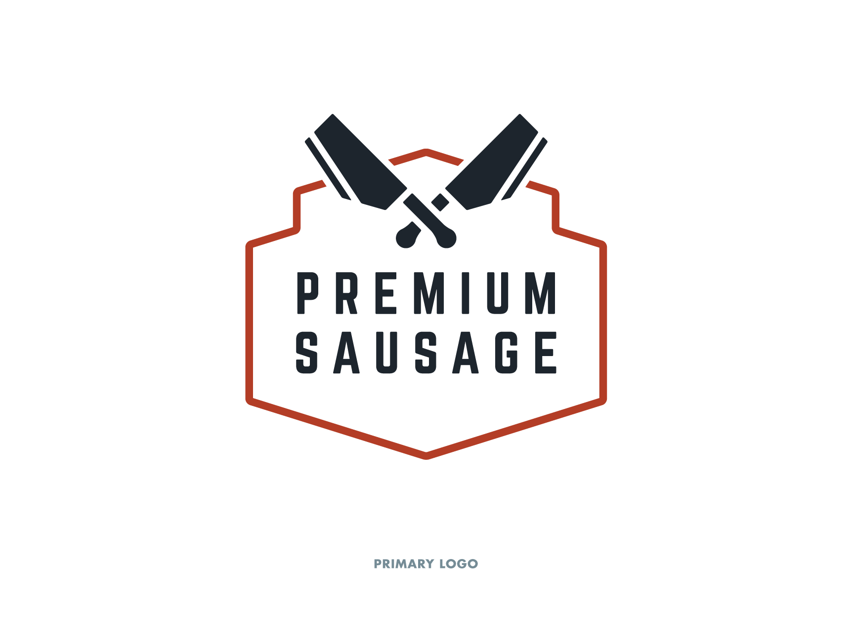
The symbolism that became important to us was something to represent a Grain Elevator and something to represent the province of Alberta. Being a tourist destination and having a diverse target audience, a symbol of Alberta could unify and draw in their potential customers. Using the angles and shape of a Grain Elevator, we were able to create a unique crest shape that is simple and nostalgic.
The Visual Identity
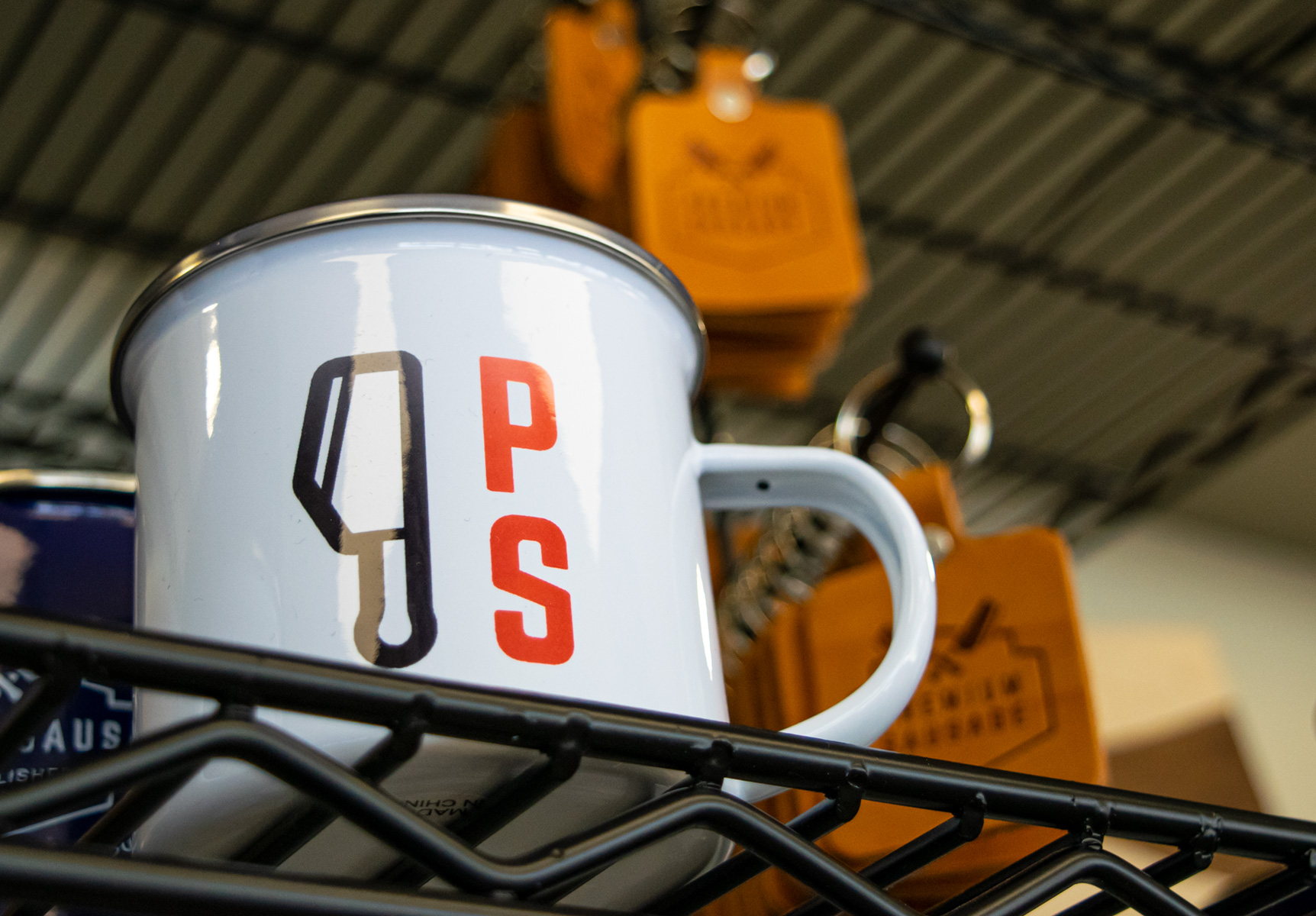
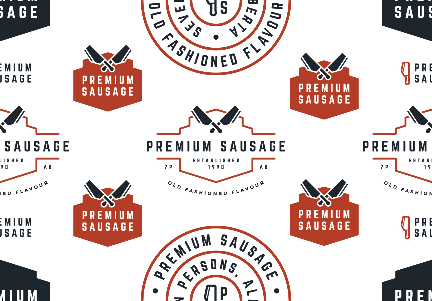
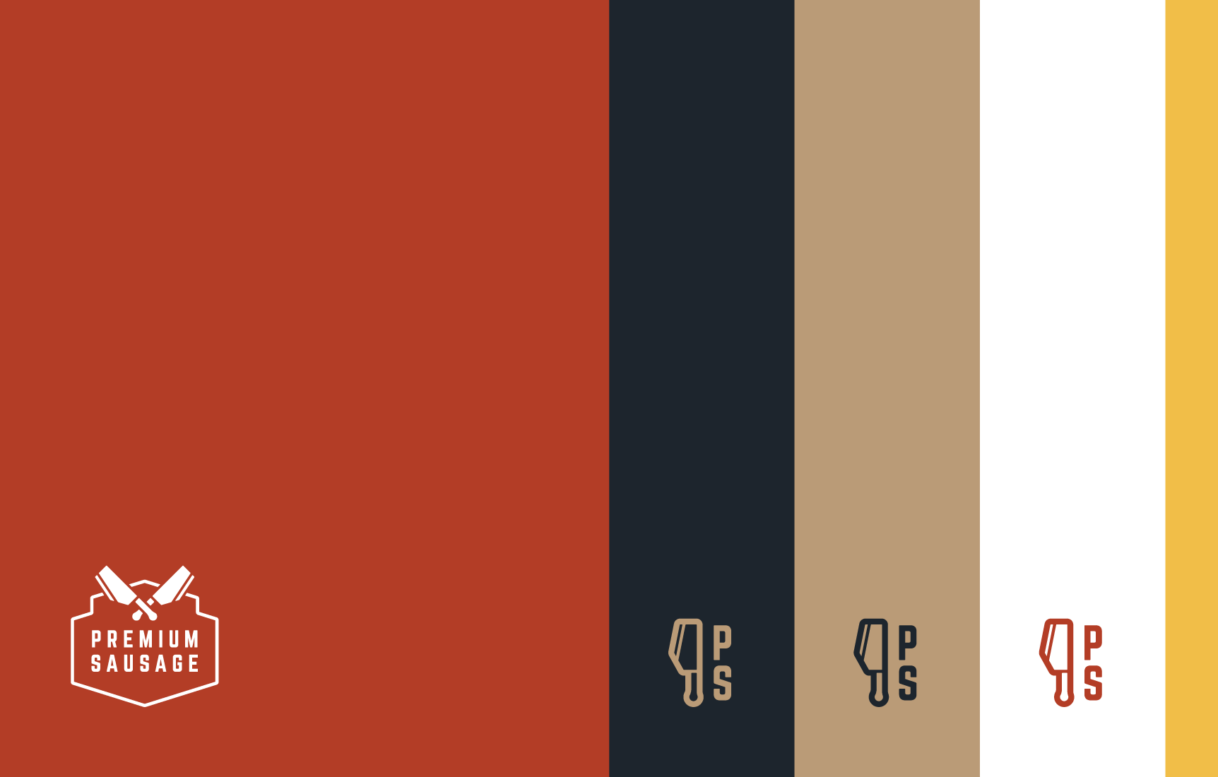
To support the variety of meat products Premium Sausage packages, we created icons and badges that could be used depending on the size and shape of the packaging.
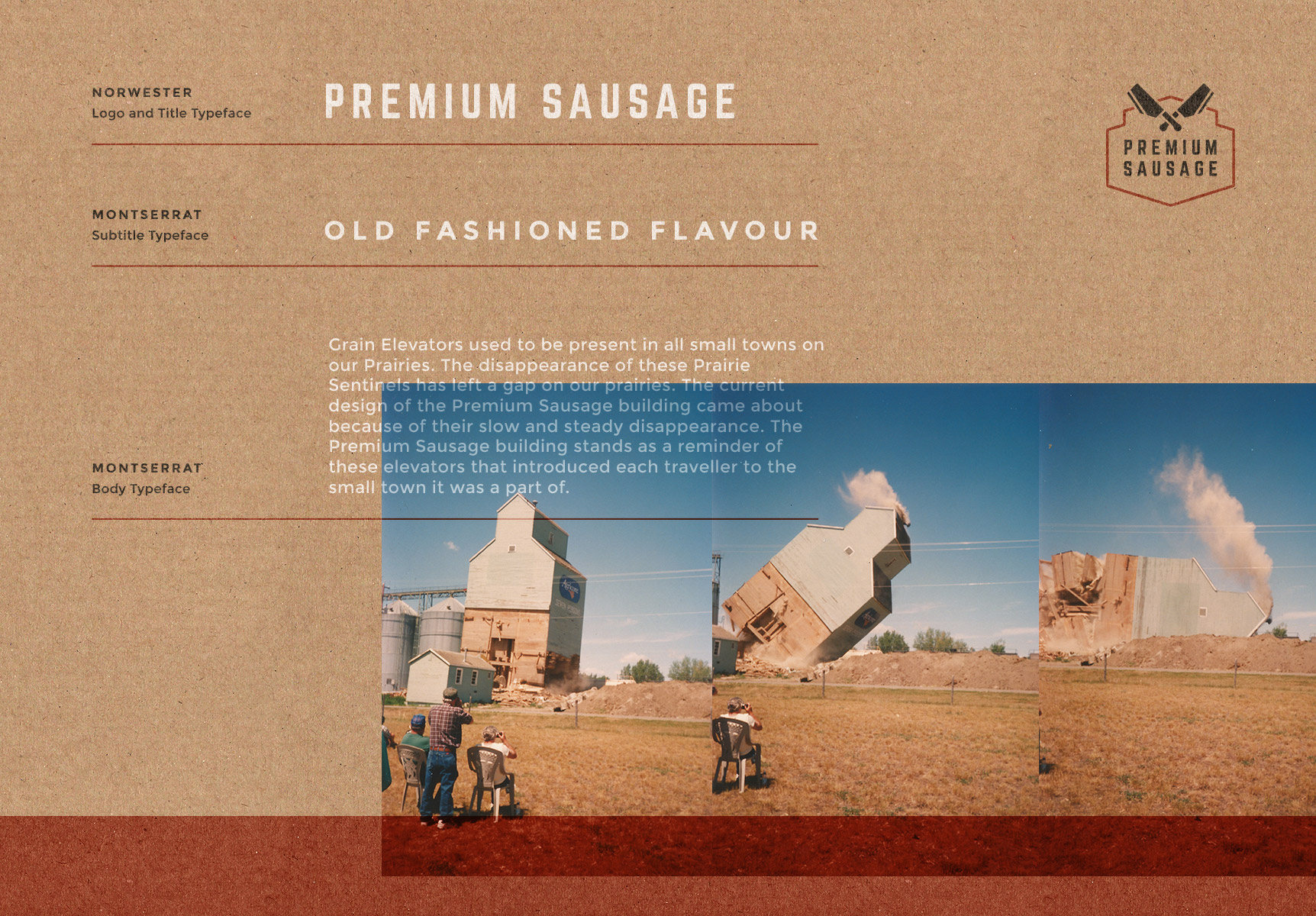
Norwester, a typeface designed by Jamie Wilson, had the feeling of nostalgia we wanted the logo and headings to express. The rounded nature of Montserrat, a typeface project led by Julieta Ulanovsky, added a simple and sincere chararcter to the body copy and subheadings.
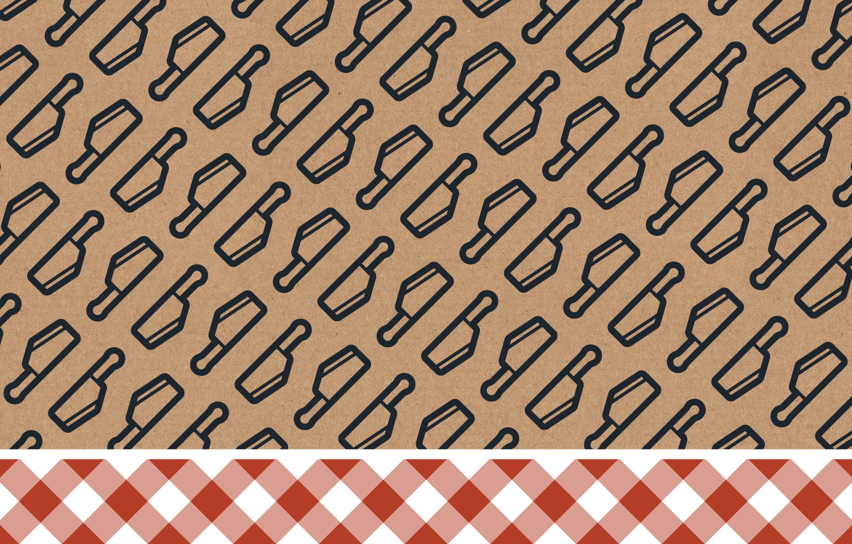
A warm and earthy colour palette, textures based on butcher paper, and patterns based on the Alberta Cleaver and picnic table cloths, make the Premium Sausage visual identity feel like a summer barbeque.
Application
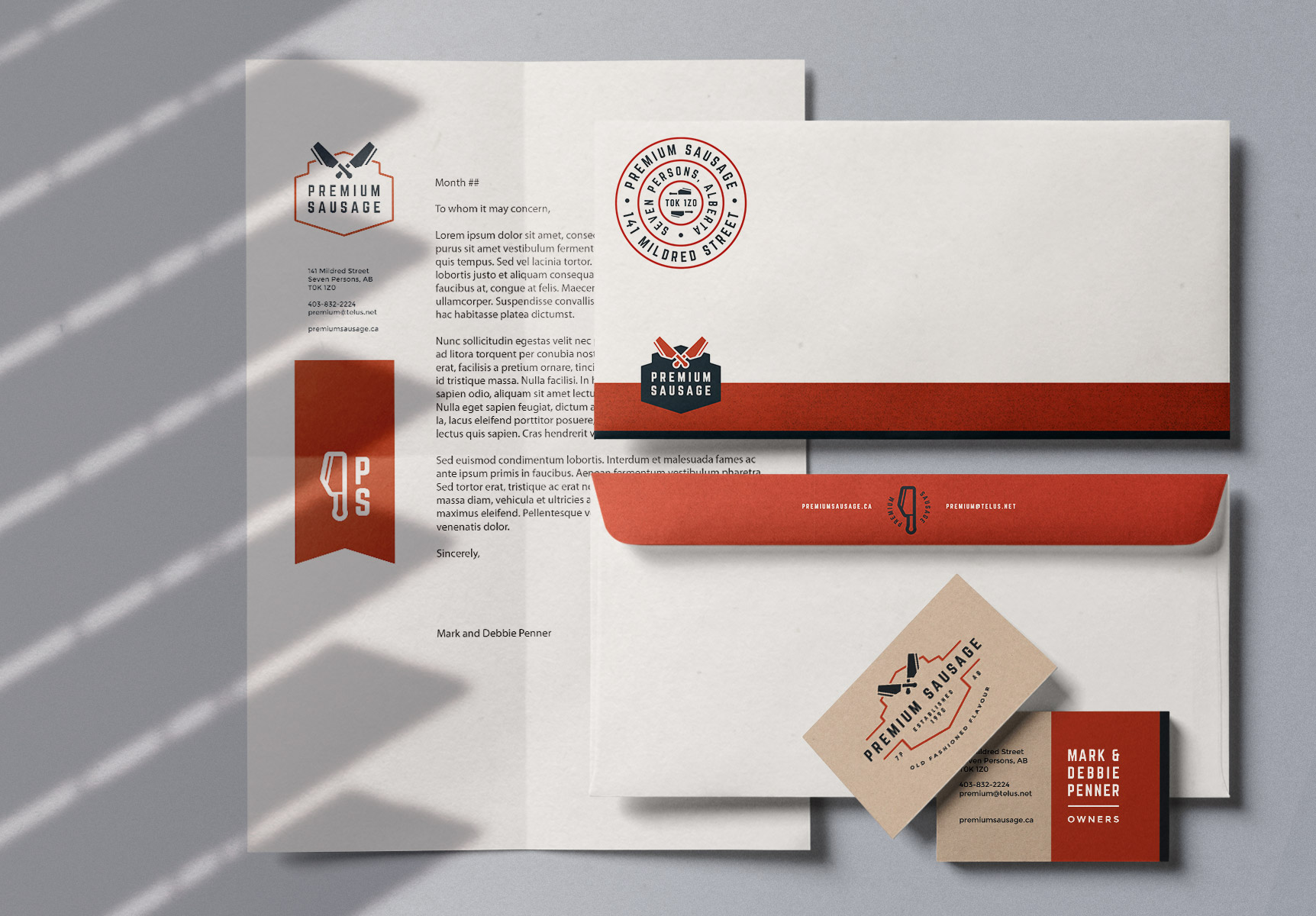
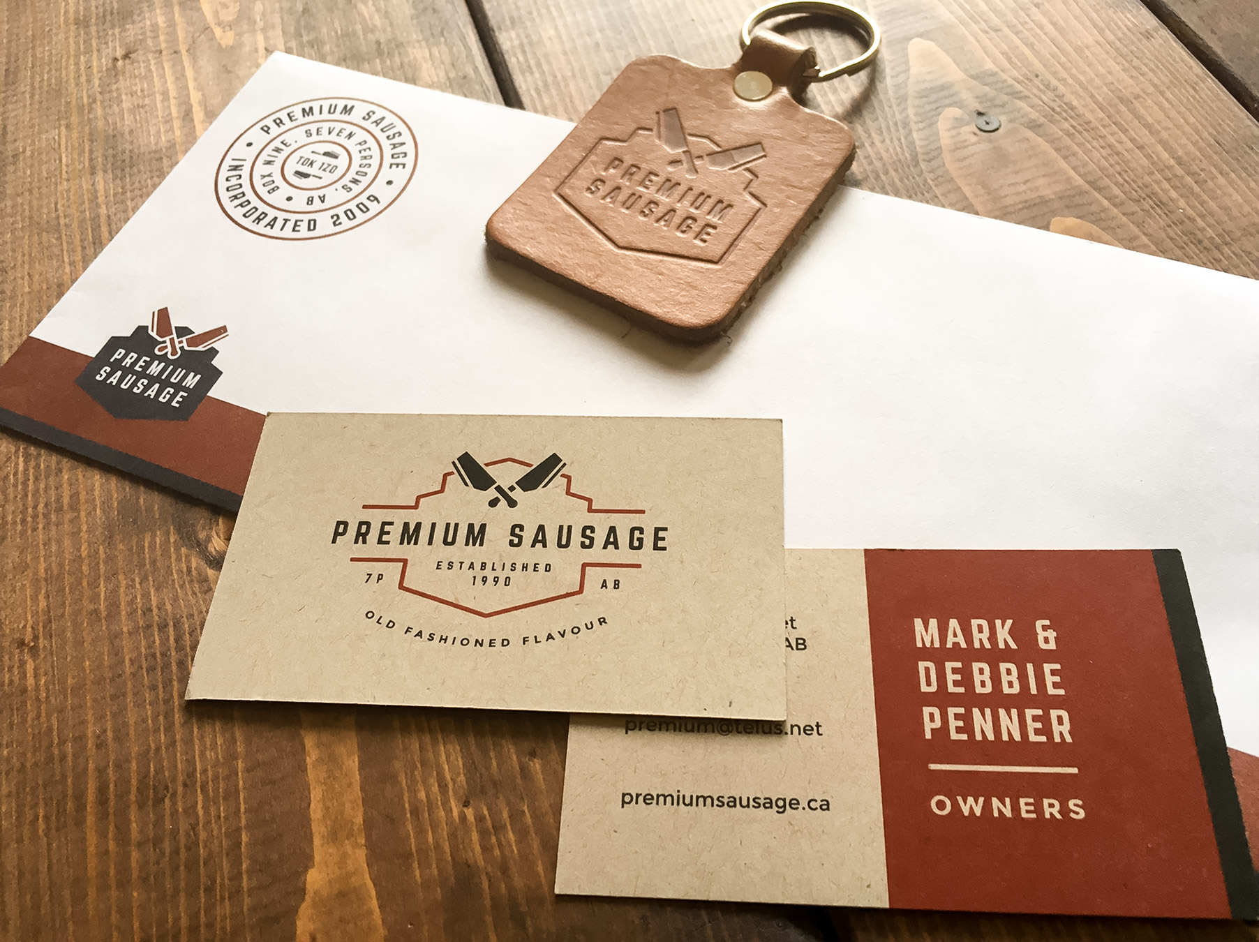
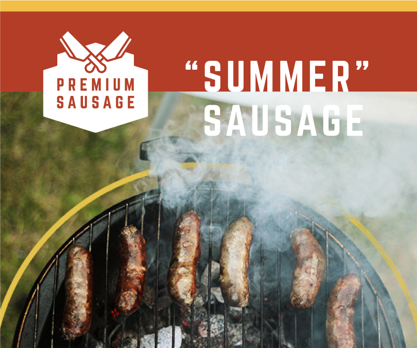
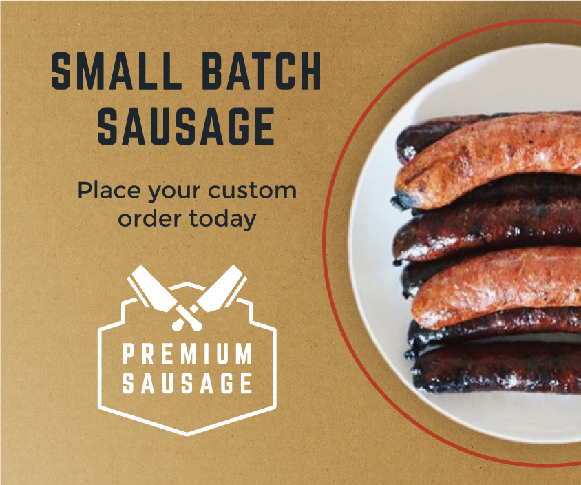
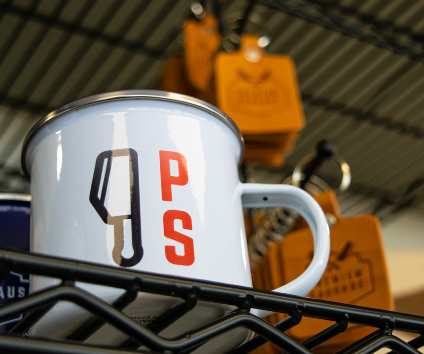
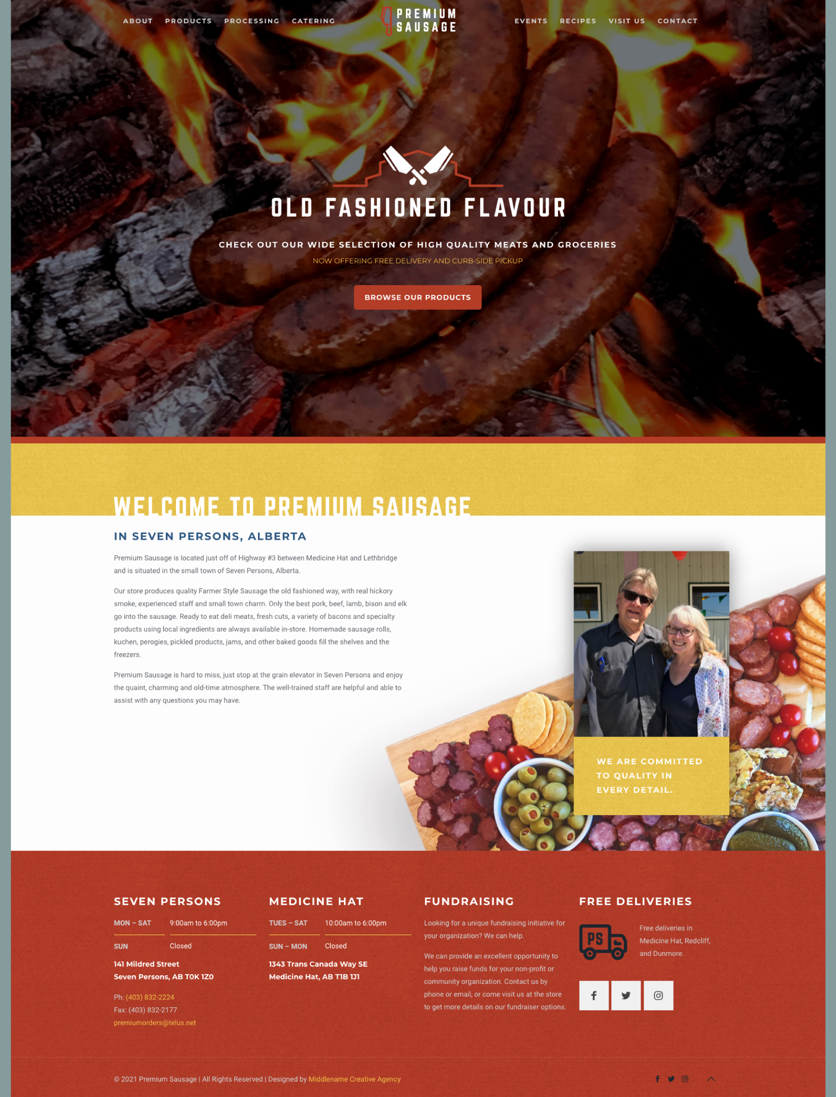
We redesigned Premium Sausage's stationery, online ads, branded merchandise, and website. The adaptability of the visual identity let us craft each piece of collateral, letting us express the craft and care that goes into Premium Sausage's products.
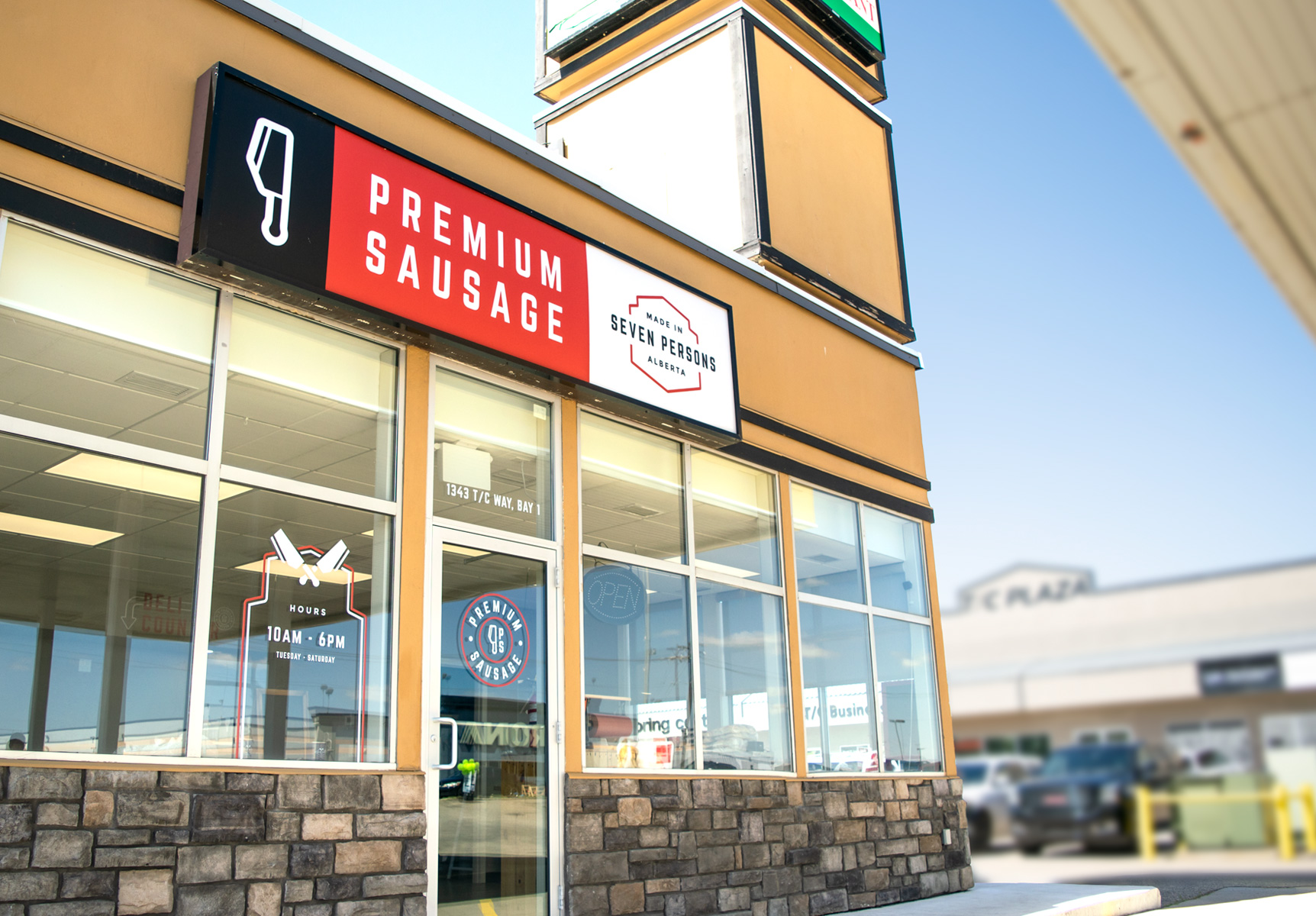
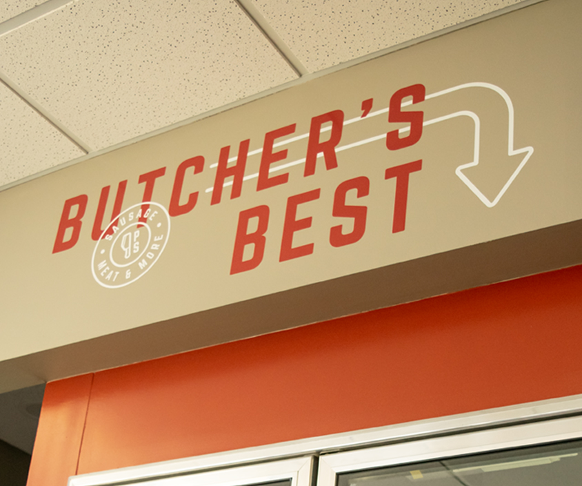
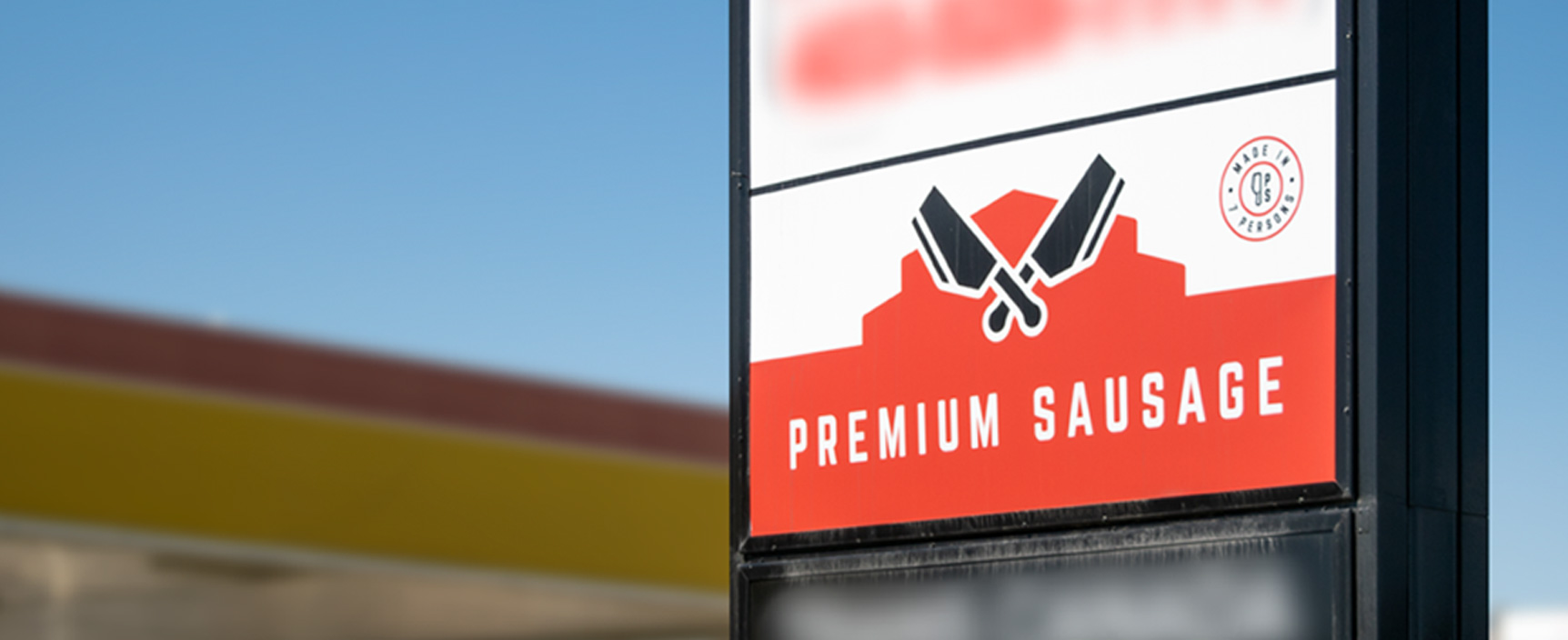
In 2021, Premium Sausage opened a second location in the nearby city, taking another large step towards reaching more of their expanded target audience. Having an established visual identity brought instant clarity to designing the signage for the new building.

"When a business is established like ours has become, it is easy to confuse being consistent with being stagnant. We needed to breathe more life into our business. Kyle truly listened and worked towards representing us as a family business. The process was extremely fun but very challenging as we had never attempted anything like this before. Kyle focused us and helped us see what we strive to do in our business and how to convey that to our customers.
This is something we could never have done on our own. We learned so much about ourselves and what customers are looking for. We feel we can confidently present our business."
- Debbie Penner, Owner at Premium Sausage
Client |
Premium Sausage |
Date |
June 2017 |
Brand Strategy |
Middlename |
Visual Identity |
Middlename |
Website |
Middlename |


